TLDR;
- Your landing page is probably failing because of a disconnect between your ad and your page (message match), a high-friction offer ("Request a Demo"), or it's just too slow.
- The single most important element is the headline. It must instantly confirm the visitor is in the right place by echoing the promise made in the ad.
- Stop asking for a demo. Instead, offer something of immediate value for free—a tool, a checklist, an audit. This builds trust and qualifies leads far better.
- This guide includes a flowchart to diagnose your page's problems and an interactive ROI calculator to see how much money your slow page speed is costing you.
- Structure your page around the customer's pain. Don't lead with features; lead with the problem you solve. Use the Problem-Agitate-Solve framework.
You're spending good money on paid traffic. You've got your targeting dialled in, your ad creative is decent, and people are clicking. But then... nothing. The leads aren't coming in, sales are flat. The silence is deafening, and you're burning through your budget with little to show for it. The problem isn't your ads. The problem is the place you're sending that expensive traffic: your landing page. It's the silent killer of countless campaigns.
Most people think a landing page is just a pretty brochure. They obsess over colours, fonts, and making sure their logo is big enough. That's a mistake. A landing page isn't a piece of art; it's a machine for converting interest into action. And right now, your machine is broken. We're going to fix it by focusing on the psychology of the buyer, not just the aesthetics of the page. Forget everything you think you know about "best practices" and let's look at what actually works.
So, why is my landing page actually failing?
Before you change a single word or image, you need to diagnose the root cause. It usually comes down to one of a few core issues. Most businesses can't see the problem because they are too close to their own product. They think everything on their page is perfectly clear, but to a cold visitor who just clicked an ad, it's a confusing mess. They arrive, can't immediately figure out if you can solve their problem, and they leave within five seconds. That's a click you paid for, gone forever.
The main culprits are almost always the same. First, there's a massive disconnect between the promise in your ad and the message on your page. The visitor feels tricked or confused, and their trust evaporates instantly. Second, your offer is asking for too much, too soon. You're asking for a marriage proposal on the first date with a "Request a Demo" button. And third, your page is technically flawed—it's painfully slow, looks terrible on a mobile phone, or is just a wall of text that's impossible to scan. Often, these issues combine, creating a perfect storm of low conversion rates. If you're seeing a lot of traffic but your paid traffic isn't converting, the landing page is the first place you need to investigate.
To help you figure out where you're going wrong, let's walk through a simple diagnostic process. Think of it as a trip to the A&E for your campaign's performance.
What's more important than my brand's logo?
It's the headline. By a mile. People don't care about your logo or your brand colours when they first land on a page from an ad. They care about one thing: "Am I in the right place to solve the problem I was just thinking about?". Your headline is the only thing that can answer that question in under three seconds. If it fails, they're gone.
This concept is called 'message match'. It's the simple idea that the headline of your landing page should directly reflect or expand upon the message in the ad that the user just clicked. If your ad says, "Stop Wasting Money on Your AWS Bill," your landing page headline can't be "The Future of FinOps is Here." That's a complete disconnect. A visitor looking to save money is now confronted with corporate jargon. They don't have time to translate; they just leave. A better headline would be, "Find £1,000 in AWS Savings in the Next 10 Minutes." It's specific, it matches the intent of the ad, and it promises immediate value.
Getting this right is not about being clever; it's about being clear. Your visitors are not looking to be impressed by your vocabulary. They are looking for a solution to their problem. Your headline should act as a giant signpost that confirms they've arrived at their destination. This single change can often have a bigger impact on your conversion rates than a complete redesign. We've seen campaigns turn around by simply aligning the ad copy with the landing page headline. It builds instant trust and orients the visitor, encouraging them to read on rather than bounce away. If you're running campaigns in a competitive space, like trying to get Google Ads to work in London, a lack of message match is the fastest way to burn your budget.
| Ad Copy | Landing Page Headline (Before) | Landing Page Headline (After) |
|---|---|---|
| "Tired of chasing late payments? Automate your invoicing and get paid on time." | "Next-Generation Accounting Software for SMEs" | "Stop Chasing Invoices. Get Paid Faster with Our Automated System." |
| "Need an emergency electrician in Manchester? 24/7 call-outs available." | "Jones Electrical: Quality and Reliability Since 1998" | "Need an Emergency Electrician in Manchester? We Can Be There in Under an Hour." |
| "Launch your online course with our all-in-one platform. Try it free today." | "Empowering Creators to Monetise Their Passion" | "The Easiest Way to Build and Sell Your Online Course. Start Your Free Trial." |
Are you asking for marriage on the first date?
You've nailed the message match. The visitor lands on your page and thinks, "Yes, this is what I was looking for." Then they see your call to action: "Request a Demo." Suddenly, a wall goes up. That's a huge commitment. It means scheduling a time, talking to a salesperson, and sitting through a presentation. It's high-friction and low-value for them. You're asking for their time and attention before you've given them anything of real value. It’s the digital equivalent of asking someone to marry you moments after meeting them. It’s no wonder so many people leave.
The "Request a Demo" button is the most arrogant Call to Action in B2B marketing. It presumes your prospect has nothing better to do than be sold to. To fix this, you must change your offer. Your landing page's only job is to provide a moment of undeniable value—an "aha!" moment that makes the prospect sell themselves on your solution. You have to give them something valuable for free to earn the right to ask for their time later.
What does this look like in practice? Instead of a demo, offer a free, automated SEO audit that shows them their top 3 keyword opportunities. Instead of "Contact Sales," offer a free 'Data Health Check' that flags the top issues in their database. For a service business, it could be a free 15-minute interactive video module on 'Handling Difficult Conversations'. We do this ourselves; we offer a free 20-minute strategy session where we audit failing ad campaigns. We solve a small, real problem for free to earn the right to solve the whole thing. This approach completely changes the dynamic. You're no longer a vendor trying to sell something; you're an expert offering help. This shift not only increases your lead volume but dramatically improves lead quality, as you're attracting people who have already experienced the value you provide. You need to stop thinking about MQLs and start creating Product Qualified Leads (PQLs) who are already convinced. This is a core part of effective B2B landing page optimisation.
How do I build a page that actually sells?
Once you've got your message match right and a compelling, low-friction offer, it's time to structure the page itself. A high-converting landing page follows a logical, persuasive flow. It's not a random collection of marketing fluff; it's a carefully constructed argument that guides the visitor from scepticism to action. We'll break it down into its core components.
The Hero Section: This is everything the visitor sees without scrolling. It includes your headline, a sub-headline, a hero image or video, and the primary call-to-action (CTA) button. This section must pass the 5-second test on its own. The headline grabs their attention (message match!), the sub-headline provides a little more context, the image visually represents the solution, and the CTA tells them exactly what to do next. The copy on the CTA button matters. "Submit" is terrible. "Get Your Free Audit" is much better because it's benefit-driven.
The Problem Section (The Nightmare): Immediately after the hero, you need to agitate the pain. Don't talk about yourself yet. Talk about them. Describe their specific, urgent, expensive nightmare in detail. Use their language. For example, "Are your cash flow projections just a shot in the dark? Are you one bad month away from a payroll crisis while your competitors are confidently raising their next round?". This shows you understand their world, which builds massive trust.
The Solution Section (The Dream & The Bridge): Now you can introduce your solution as the bridge to a better place. First, paint a picture of the "dream" state. What does life look like after they use your product? "Imagine opening your cloud bill and smiling. You see where every dollar is going and waste is automatically eliminated." Then, briefly explain *how* your service or product is the bridge that gets them there. This is where you can introduce 3-4 key features, but always tie each feature to a benefit. Feature: "Automated cost allocation." Benefit: "So you can see exactly which feature is costing you the most."
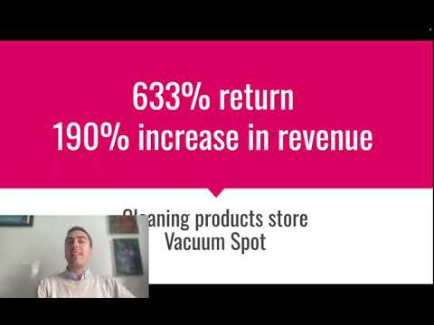
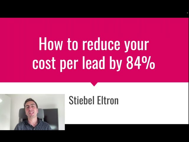
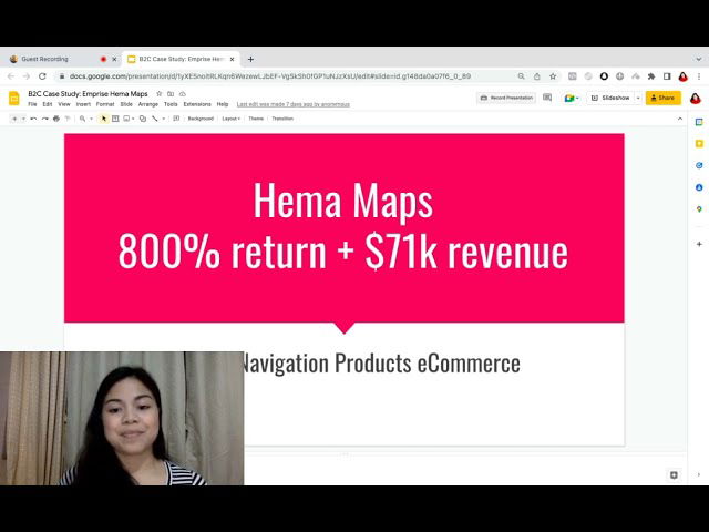
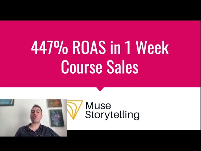
Social Proof: People don't trust brands; they trust other people. Your page needs social proof to be believable. This can be in the form of customer testimonials (with real names and photos), logos of companies you've worked with, case study snippets with impressive stats, or review scores from sites like G2 or Capterra. This isn't a "nice to have"; it's a non-negotiable element. Without it, your claims lack credibility.
The Final CTA: Repeat your call to action at the bottom of the page. Don't make them scroll all the way back up to convert. The visitor has read your entire argument; now is the time to ask for the action again. Make it big, clear, and consistent with the offer you made in the hero section. This structure provides a clear narrative path for the visitor and is a cornerstone of building high-converting landing pages.
Will a faster page really make me more money?
Yes. It's not a debate. Every single second a visitor has to wait for your page to load, the probability they will leave increases exponentially. You are paying good money for that click—£2, £5, maybe even £50 for a competitive B2B keyword. To have them abandon the session because your images were too big is like setting fire to a pile of cash. Page speed is not a 'techy' issue for your IT department to worry about later; it's a core conversion and business issue.
Think about your own behaviour. When you click a link and are met with a white screen for four seconds, what do you do? You hit the back button. Your potential customers are no different. They are impatient. Google knows this, which is why page speed is also a factor in your Quality Score for Google Ads, meaning a slow page can actually make your clicks more expensive. It's a double whammy: you pay more for the click, and the person who clicks is less likely to convert. It's a hole in your marketing bucket, and you need to plug it.
The good news is that the biggest wins are often the simplest. You don't need to be a web developer to make a difference. The most common culprit is oversized images. Use a free online tool to compress your images before you upload them. Choose a quality web host; cheaping out on hosting is a false economy. Limit the number of flashy animations and custom scripts you're running. Each one adds to the load time. It's a simple equation: faster page = better user experience = higher conversion rate = more money. It's one of the most direct and highest ROI optimisations you can make. The reason so many businesses have a low conversion rate on Google Ads is often traced back to a slow, clunky website experience.
How do I stop guessing and start knowing what works?
You've implemented all the advice above. Your page is faster, your message matches the ad, and you have a great, low-friction offer. You're probably already seeing better results. But how do you take it to the next level? You stop guessing and start testing. A/B testing, or split testing, is the process of showing two different versions of your landing page to your audience to see which one performs better. It is the only way to know for sure if a change you make has a positive or negative impact.
The concept is simple. You create a second version of your page (the 'variation') with one single change. This could be a different headline, a different CTA button colour, or a new hero image. Then, you use software to split your incoming paid traffic, sending 50% to the original page (the 'control') and 50% to the variation. After you've collected enough data (usually at least a few hundred conversions), you can see with statistical confidence which version converted better. The winner becomes the new control, and you test another element. It's a continuous cycle of improvement.
However, people often make a mess of this. The biggest mistake is testing too many things at once. If you change the headline, the image, and the offer all at the same time, you have no idea which change was responsible for the increase (or decrease) in conversions. You must be disciplined and test one variable at a time. Another common mistake is calling a test too early. You might see one version pulling ahead after 50 visitors, but this is often just random chance. You need to let the test run until you have a large enough sample size to trust the results.
What should you test first? Always start with the elements that have the biggest potential impact. Don't waste time testing the colour of a footer link. Focus on the big levers:
1. The Offer: Testing a free tool vs. a free consultation can have a dramatic impact.
2. The Headline: This is the first thing people read. A new headline can completely change your conversion rate.
3. The Hero Image/Video: Does a video of the product in action work better than a static image?
4. The Call to Action: Test the button copy, colour, and placement.
Systematic testing is the difference between amateur and professional campaign management. It turns marketing from a game of chance into a science. If you find your campaigns are consistently underperforming, our playbook for troubleshooting paid ads can help you identify where to focus your testing efforts.
So what should I do right now?
You've absorbed a lot of information. The key now is to turn this knowledge into action. Don't try to fix everything at once. That's a recipe for getting overwhelmed and doing nothing. Instead, focus on a prioritised plan. Start with the foundational issues that are likely causing the most damage to your conversion rates. I've detailed my main recommendations for you in the table below. Work through them in order. Fix your message match first, then create a better offer. Once those are in place, you can move on to the more granular details of page structure and testing. This is the exact process we use when we take on a new client who comes to us with a page that isn't converting.
Remember, landing page optimisation is not a one-time project; it's an ongoing process. Your first set of changes will definitely make an impact, but the real gains come from continuous testing and refinement. You're looking for incremental improvements that compound over time. A 10% lift here and a 15% lift there can double the performance of your paid advertising without spending a single extra pound on clicks. If you're struggling to convert the leads you get from Google Ads, the issue often lies with what happens after the click, a problem we cover in depth when we look at why Google Ads leads sometimes don't convert into actual business.
| Action Item | Why It's Important | First Step | Priority |
|---|---|---|---|
| Fix Message Match | This is the #1 reason visitors bounce. It builds instant trust and confirms they're in the right place. | Open your top-performing ad. Copy its main promise. Rewrite your landing page headline to match it exactly. | High |
| Create a Low-Friction Offer | "Request a Demo" kills conversions. A valuable, free asset builds trust and generates higher quality leads. | Brainstorm a simple checklist, tool, or guide you can give away. Create a persuasive new CTA button for it. | High |
| Check Page Speed | A slow page is burning your ad budget. Every second of delay costs you conversions and money. | Run your URL through Google's PageSpeed Insights. Focus on compressing the largest images first. | Medium |
| Add Social Proof | Your claims are not believable without proof. Testimonials and logos are essential for building credibility. | Email your 3 happiest customers and ask for a short testimonial. Add their photo and name to your page. | Medium |
| Start A/B Testing | Stop guessing. Data-driven testing is the only way to achieve long-term, sustainable improvement. | Set up your first simple A/B test. Test your new headline against your old one. Let it run until you have 100+ conversions. | Ongoing |
Implementing all of this takes time, effort, and expertise. You have to understand buyer psychology, be a decent copywriter, and have a grasp of the technical elements. It's a separate skill set from just running ads. If you're a founder or a busy marketing manager, you might not have the bandwidth to do it all properly. That's where expert help can make a huge difference.
Working with an agency that specialises in conversion-focused paid advertising means you get a team that lives and breathes this stuff every day. We've seen what works (and what doesn't) across hundreds of campaigns and industries. We can diagnose the problems with your landing page in minutes, not weeks, and implement proven strategies to fix them. If you feel like you're stuck and want an expert pair of eyes on your campaigns and landing pages, consider booking a free, no-obligation strategy session with us. We'll give you a full audit and a clear, actionable plan to start turning more of your clicks into customers.

Lukas Holschuh
Founder, Growth & Advertising Consultant
Great campaigns fail without expertise. Lukas and his team provide the missing strategy, optimizing your entire advertising funnel—from ad creatives and copy to landing page design.
Backed by a proven track record across SaaS, eLearning, and eCommerce, they don't just run ads; they engineer systems that convert. A data-driven partnership focused on tangible revenue growth.