Hi there,
Thanks for reaching out! I had a look over your situation and it's a classic, and frankly, a very frustrating problem to have. Getting lots of cheap clicks but no sales feels like you're filling a bucket with a massive hole in it. The good news is, it's almost always a solvable issue, but the solution is rarely found inside the ad manager itself.
I'm happy to give you some of my initial thoughts and guidance based on what you've described. The fact that your ads are generating clicks and even some add-to-carts means they are doing part of their job – they're getting people in the door. The problem is what happens after they step inside. We need to figure out why they're leaving without buying anything.
TLDR;
- Your problem almost certainly isn't your ads, it's your website and your offer. Clicks mean the ads are working; no sales mean the website is failing to convert that interest.
- Slapping a 50% discount on everything often destroys trust rather than encourages sales. It can make your products look cheap, low-quality, or even make your store seem like a scam.
- You must become a detective and find out exactly where in the funnel people are dropping off. Our diagnostic flowchart inside will help you pinpoint the weak link in your sales process.
- Building trust is everything for a new store. Without social proof, clear policies, and a professional look, people will not risk giving you their credit card details.
- This letter includes an interactive ROAS calculator to help you understand the real numbers behind your ad spend and a diagnostic flowchart to help you troubleshoot your customer journey.
It’s not your ads that are broken, it’s your sales process
Let's get one thing straight right away. You said your ads are "set up well and optimized for purchases". This is a common misconception. While you might have ticked the right boxes in Ads Manager – chosen the 'purchases' objective, set up your pixel – the final measure of a "well set up" campaign is whether it generates profit. If it's not making sales, it's not working, no matter how cheap the clicks are.
Think of your ad as a sign outside a shop. Your sign is clearly attractive enough to get people to walk in. But once they're inside, something is putting them off. Maybe the shop is messy, the prices aren't clear, the staff seem untrustworthy, or the products on the shelves don't look as good as they did on the sign. Your job now is to stop worrying about the sign for a minute and start fixing the shop itself.
To do this, you need to follow the data. You mentioned you get a few 'add to carts' and even an 'initiated checkout'. This is fantastic data. It tells us people are getting past the initial landing page and are showing real buying intent. The breakdown is happening at the final hurdles. Let's use a flowchart to visualise this process and find the exact point of failure.
(You are here)
Based on your message, the problem lies somewhere between the 'Add to Carts' and 'Sale!' stages. So let's focus there.
We'll need to look at your offer and product pages...
The fact people are adding products to their cart but not checking out is a massive clue. It means they want the product, but something stops them from completing the purchase. This is often where trust, pricing, and unexpected costs come into play.
The 50% Off Trap
First, let's talk about that 50% off promotion. It seems like a logical step – if people aren't buying, lower the price. But for a new, unknown store, a massive discount like that can be a huge red flag. It screams "low quality," "desperate," or even "scam." Instead of building desire, it creates suspicion. Why is it so cheap? Is there something wrong with it? Is this even a real store?
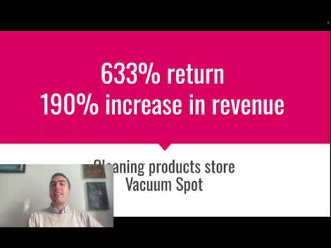
I remember one eCommerce client selling high-quality cleaning products. Their initial ads weren't converting. They were tempted to run a huge sale. Instead, we advised them to focus on demonstrating the product's value with better creative and adding tons of customer reviews to the site. We changed the offer from a discount to a "bundle and save" deal. Sales took off, and we ended up getting a 633% return. The price wasn't the issue; the perceived value and trust were.
You'd be much better off offering a smaller, more believable discount (like 10-15% for a first order), free shipping, or a free gift with purchase. These feel like genuine incentives, not clearance sales for dodgy goods.
Product Pages That Don't Sell
Your product page has one job: to convince someone that your product is worth their money. This comes down to a few key elements:
- -> Photos: Are they professional? High-resolution? Do they show the product from multiple angles? If it's something to be worn, is it on a model? People can't touch or feel the product, so your photos have to do all the heavy lifting. Grainy pictures taken on a phone in bad lighting won't cut it.
- -> Descriptions: A description shouldn't just list features. It needs to sell the benefit. It should answer the customer's question: "What's in it for me?". It needs to overcome objections and create an emotional connection. Good copy makes people feel understood.
- -> Social Proof: Are there reviews on the page? Star ratings? Testimonials? A new buyer is taking a risk on you. Seeing that other people have bought from you and were happy is probably the single most powerful persuasion tool you have.
Here's a quick example of how to shift from a feature-based description to a benefit-based one. Let's imagine you're selling a handcrafted leather wallet.
Before (Feature-Focused) |
After (Benefit-Focused) |
|---|---|
|
This wallet is made from full-grain leather. It has 6 card slots, a cash compartment, and is hand-stitched. Dimensions are 11cm x 9cm. |
Tired of bulky wallets ruining the line of your trousers? Our slim profile wallet is crafted from supple, full-grain leather that ages beautifully, developing a unique character over time. It’s designed for the minimalist, with just enough room for your essential cards and cash, eliminating clutter. Each stitch is done by hand, ensuring a level of durability that mass-produced wallets simply can't match. This isn't just a wallet; it's a daily companion that gets better with every year. |
See the difference? The first one is a list of facts. The second one tells a story and solves a problem.
I'd say you have a massive trust problem...
This is the big one for any new store. A visitor from a Facebook ad is a complete stranger. You're asking them to give you their name, address, and credit card number. That requires a huge leap of faith. Your entire website needs to be designed to make them feel safe and confident in their decision.
Go through your website as if you were a skeptical customer. Ask yourself these questions:
- -> Does it look professional? Or does it look like a cheap template that was thrown together in an afternoon? Spelling mistakes, low-quality images, and a messy layout will send people running.
- -> Can I easily contact you? Is there a clear contact page with an email address, phone number, or even a physical address? Hiding this information makes you look shady.
- -> What are your policies? Do you have an easy-to-find and easy-to-understand shipping policy and returns policy? People want to know what happens if they don't like the product or if it arrives broken.
- -> Are there any trust badges? Displaying logos of secure payment methods (Visa, Mastercard, PayPal) and having an SSL certificate (the little padlock in the browser bar) are non-negotiable basics.
- -> Who are you? An "About Us" page that tells the story behind your brand can make a huge difference. People like buying from people, not from faceless, anonymous websites.
Without these elements, even with perfect ads and the best products, you'll struggle to make sales. The friction caused by a lack of trust is just too high. It's like asking someone to marry you on the first date. You haven't earned the right to ask for that level of commitment yet.
Before you spend another penny on ads, you need to be brutally honest with yourself about your website. Get friends and family to look at it and give you their first impressions. You might be surprised at what you hear. It's often the small details that make the biggest difference.
To help you put this into perspective, it's useful to understand the numbers that actually matter. Clicks and engagement are vanity metrics. What really matters is your Return on Ad Spend (ROAS). Are you making more money than you're spending? This calculator can help you figure that out.
You probably should look at your checkout process
You mentioned someone reached the checkout page. This is the final frontier. They were ready to buy. They had their card in hand. And then they vanished. Why?
The checkout process needs to be as frictionless and simple as possible. Common reasons for abandonment here include:
- -> Unexpected Costs: This is the number one killer of sales. If a customer gets to the checkout and is suddenly hit with a massive shipping fee or unexpected taxes, they will leave. Be transparent about all costs upfront. If possible, offer free shipping – it’s a huge psychological motivator.
- -> Forcing Account Creation: Don't make people create an account to buy from you. Always offer a guest checkout option. You can ask them to create an account *after* the purchase is complete.
- -> Complicated Forms: Only ask for the information you absolutely need. The more fields someone has to fill in, the more likely they are to give up.
- -> Limited Payment Options: Do you offer PayPal? Apple Pay? Google Pay? People trust these services and they make checkout much faster. If you only offer credit card payments, you will lose sales.
Your job is to make it easier for people to give you money. Go through your own checkout process on both desktop and mobile. Is it fast? Is it easy? Is it confusing in any way? Fix any and every point of friction you find.
I've detailed my main recommendations for you below based on this common scenario. This is a step-by-step plan to turn your traffic into customers.
So, what's next?
The path forward involves putting a pause on scaling your ad spend and focusing intensely on fixing the leaks in your conversion funnel. It's a systematic process of optimisation, not guesswork. It requires a deep understanding of customer psychology and a data-driven approach to identifying and fixing these issues. This is often where store owners find they need expert help.
Diagnosing and fixing conversion problems is exactly what we do. We've worked with numerous eCommerce brands, like a women's apparel store where we generated a 691% return, and a subscription box client for whom we hit a 1000% ROAS. We achieve this not by finding some secret "ad hack," but by methodically optimising the entire customer journey, from the first ad impression to the final thank you page.
You've already proven there's interest in what you're selling. Now you just need to convert that interest into revenue. If you'd like to have a second pair of expert eyes look over your website and ad account, we offer a completely free, no-obligation strategy consultation. We can walk through your site together, pinpoint the exact issues, and give you a clear, actionable plan to start getting the sales you deserve.
Hope this helps!
Regards,
Team @ Lukas Holschuh

Lukas Holschuh
Founder, Growth & Advertising Consultant
Great campaigns fail without expertise. Lukas and his team provide the missing strategy, optimizing your entire advertising funnel—from ad creatives and copy to landing page design.
Backed by a proven track record across SaaS, eLearning, and eCommerce, they don't just run ads; they engineer systems that convert. A data-driven partnership focused on tangible revenue growth.