Hi there,
Thanks for reaching out! Happy to give you some initial thoughts and guidance on why your landing page might not be converting. It's a really common problem, but the solution is often not where people think it is. Most people jump straight to A/B testing button colours, but the real issue is usually much deeper in your strategy.
I'll walk you through how I'd diagnose this. It’s less about tiny tweaks and more about getting the fundamental building blocks right first. Once those are solid, the conversions tend to follow.
TLDR;
- Your landing page isn't the real problem; it's the final symptom of a broken strategy. Fixing it starts way before you even look at the page design.
- Stop defining your customer by demographics. You need to understand their specific, urgent, and expensive 'nightmare' – the core problem that keeps them up at night.
- Your ads and your landing page headline must make a direct promise to solve that nightmare. If there's a disconnect, you've already lost.
- The biggest conversion killer is your offer. A high-friction "Request a Demo" button is poison. You must provide instant value with a low-friction offer like a free trial, a useful tool, or a free strategy session.
- This letter includes a diagnostic flowchart to help you pinpoint the failure in your funnel and an LTV calculator to change how you think about acquisition costs.
You're focusing on the wrong thing... It's not your landing page
Okay, let's be brutally honest. When someone says "my landing page isn't converting," they're looking at the last step of a long journey. It’s like blaming the cashier for a shop having no customers. The problem almost always starts much, much earlier. You could have the most beautifully designed, professionally written landing page in the world, but if you're sending the wrong people to it with the wrong message and the wrong offer, it will fail. Every single time.
Tweaking headlines, changing button colours, and moving images around is what people do when they don't know what else to do. It’s busy work that makes you feel productive, but it rarely moves the needle in any meaningful way if the core strategy is flawed. The real work is in understanding the chain of events that leads a person to your page in the first place.
The chain looks like this: Audience (Pain) -> Ad (Promise) -> Offer (Value) -> Landing Page (Proof).
If any link in that chain is weak, the whole thing breaks. And 99% of the time, the break happens in one of the first three links. Your landing page is just where the failure becomes obvious and expensive. So, let’s stop looking at the page for a moment and start at the beginning.
1. Audience
Who are they and what is their specific, urgent 'nightmare'?
2. Ad
Does your ad make a clear promise to solve their nightmare?
3. Offer
Is your offer low-friction and high-value? Does it help them *right now*?
4. Landing Page
Does the page simply and effectively prove you can deliver on the promise?
We'll need to look at your ICP... it's a nightmare, not a demographic
So, let's talk about your audience. Forget the sterile, demographic-based profile your last marketing hire made. "Companies in the finance sector with 50-200 employees" or "mums aged 30-45 living in London" tells you absolutely nothing of value. It’s a lazy shortcut that leads to generic ads that speak to no one.
To stop burning cash, you must define your ideal customer profile (ICP) by their pain. You need to become an expert in their specific, urgent, expensive, career-threatening nightmare. Your customer isn't a job title; they're a person in a state of crisis, actively looking for a way out.
- -> A Head of Engineering isn't just a 'tech leader'. She's a leader terrified of her best developers quitting out of frustration with a broken workflow that you can fix.
- -> For a legal tech SaaS, the nightmare isn't 'needing document management'. It's a partner missing a critical filing deadline and exposing the firm to a malpractice suit.
- -> For a home cleaning service, the nightmare isn't a 'messy house'. It's the overwhelming feeling of failure and stress from not being able to keep on top of things while juggling work and kids.
Your ICP isn't a person; it's a problem state. Your entire marketing effort must be laser-focussed on that problem state. Once you've isolated that nightmare, you can find them. Where do they go to talk about this pain? What podcasts do they listen to on their commute? What industry newsletters do they actually open? What specific keywords are they typing into Google at 11pm when the problem feels overwhelming?
For B2B, are they members of specific LinkedIn groups? Do they follow people like Jason Lemkin or Dave Gerhardt? For B2C, are they in Mumsnet forums? Are they following specific 'cleanfluencers' on Instagram?
This intelligence isn't just data; it's the blueprint for your entire targeting and messaging strategy. If you haven’t done this work, you have no business spending another pound on ads. You're just gambling.
I'd say you need a message they can't ignore
Once you understand their nightmare, your ad has one job: to reflect that nightmare back at them and make a clear promise of a solution. Your ad copy isn't about listing features; it's about demonstrating empathy and showing them a path to relief. This is where most ad copy fails. It’s all about "us," our product, our features. It needs to be all about "them" and their problem.
Here are a few frameworks that work:
For a high-touch service business (like an agency or consultancy), use Problem-Agitate-Solve. You don't sell "fractional CFO services"; you sell a good night's sleep.
- -> Problem: "Are your cash flow projections just a shot in the dark?"
- -> Agitate: "Are you one bad month away from a payroll crisis while your competitors are confidently raising their next round?"
- -> Solve: "Get expert financial strategy for a fraction of a full-time hire. We build dashboards that turn uncertainty into predictable growth."
For a B2B SaaS product, use the Before-After-Bridge. You don't sell a "FinOps platform"; you sell the feeling of relief.
- -> Before: "Your AWS bill just arrived. It’s 30% higher than last month, and your engineers have no idea why. Another fire to put out."
- -> After: "Imagine opening your cloud bill and smiling. You see where every dollar is going and waste is automatically eliminated."
- -> Bridge: "Our platform is the bridge that gets you there. Start a free trial and find your first £1,000 in savings today."
The message in your ad is a promise. The click is their acceptance of that promise. When they land on your page, the headline must instantly confirm they are in the right place by echoing that same promise. If your ad says "Stop wasting money on your AWS bill" and your landing page headline says "The Future of Cloud Management," you've broken the promise. The disconnect creates confusion and mistrust, and they will leave in seconds.
You probably should delete the "Request a Demo" button
Now we arrive at what is very likely your biggest problem. The single most common failure point in all of paid advertising: the offer.
The "Request a Demo," "Book a Call," or "Contact Us" button is perhaps the most arrogant and self-serving Call to Action ever conceived. It presumes your prospect, who is busy and sceptical, has nothing better to do than book a 30-minute slot in their diary to be sold to by a stranger. It is incredibly high-friction and offers zero immediate value. It screams, "I want your time and money, but I'm not willing to give you anything of value first."
Your offer’s only job is to deliver a moment of undeniable value—an "aha!" moment that makes the prospect sell themselves on your solution. It must be low-friction and high-value. You must solve a small, real problem for them for free to earn the right to ask them to pay you to solve the whole thing.
This is where you need to be creative. What can you give away that costs you little but is immensely valuable to them?
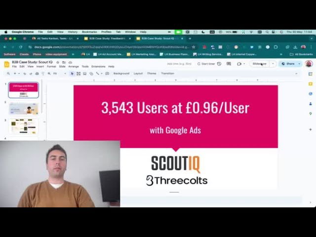
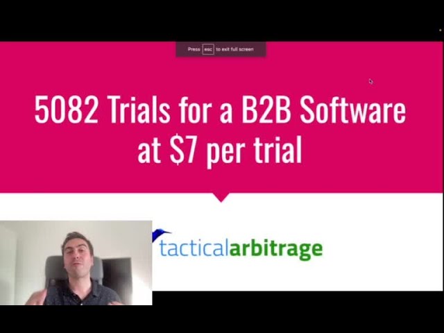
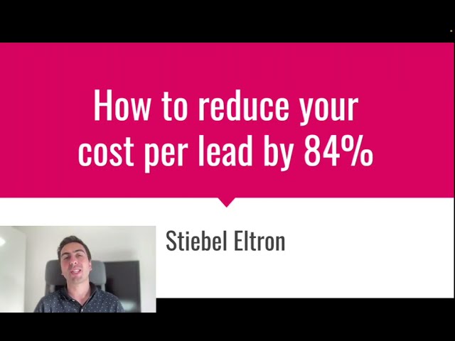
- For SaaS founders: This is your unfair advantage. The gold standard is a free trial (no card details needed). Let them use the actual product. Let them feel the transformation. A freemium plan is even better. We've seen this work wonders for B2B SaaS clients, one of them got over 1500 trials this way. Another client reduced their Cost Per Acquisition from £100 down to just £7 by switching from a demo model to a self-serve trial. The product becomes the salesperson.
- For Agencies/Consultants: You are not exempt. You must bottle your expertise. We do this by offering a free 20-minute strategy session where we audit failing ad campaigns. It's pure value. Others might offer a free, automated SEO audit that shows top keyword opportunities, or a 'Data Health Check' tool.
- For Service Businesses: A free 'first clean', a free initial design mockup, a free 15-minute consultation on their specific problem.
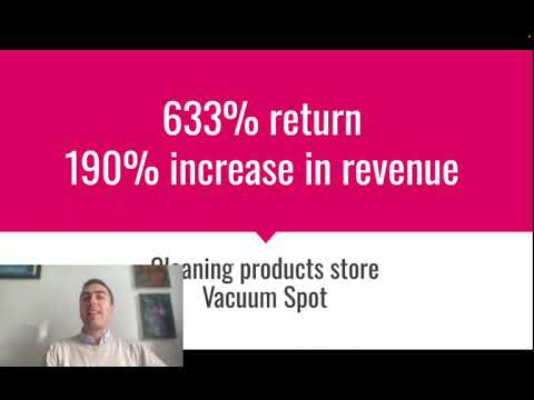
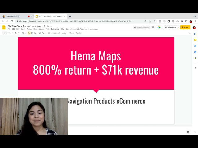
- For eCommerce: A valuable discount on the first order is standard. Better yet, a free guide or tool related to your products. Selling high-end kitchen knives? Offer a free PDF guide on "5 Professional Knife Skills That Will Change How You Cook."
Your offer is the entire game. A great offer sent to the right audience can forgive a mediocre landing page. A terrible offer will fail even with the best page design in the world. The aim is to make them think, "Wow, if this is what they give away for free, imagine how good the paid stuff must be."
You'll need a new mindset... what can you afford to pay?
This brings me to another critical point. Most people are obsessed with lowering their Cost Per Lead (CPL) or Cost Per Acquisition (CPA). This is the wrong way to think. The real question isn't "How low can my CPL go?" but "How high a CPL can I afford to acquire a truly great customer?"
The answer lies in your Customer Lifetime Value (LTV). If you don't know this number, you are flying blind. You can't make intelligent decisions about ad spend without it. Here’s a simple way to calculate it for a subscription or recurring revenue business:
- Average Revenue Per Account (ARPA): What do you make per customer, per month/year?
- Gross Margin %: What's your profit margin on that revenue?
- Monthly Churn Rate: What percentage of customers do you lose each month?
Suddenly, that £50 lead from a qualified prospect on LinkedIn doesn't seem expensive, does it? It looks like a bargain. This is the maths that unlocks aggressive, intelligent growth. It frees you from the tyranny of cheap, low-quality leads and allows you to go after the best customers, wherever they are.
Finally... you'll need to look at your landing page
Right, so now that we've fixed your audience targeting, your messaging, and your offer, we can *finally* look at the landing page. Its job is now much simpler. It doesn't need to do all the heavy lifting of selling. It just needs to do two things:
- Confirm the Promise: The user should land and immediately know they're in the right place. The headline and hero image should be a seamless continuation of the ad they just clicked.
- Provide Proof and Remove Friction: It needs to quickly and clearly provide the proof to back up your promise, and make it incredibly easy to accept your low-friction offer.
Here’s a simple checklist for a high-converting page, assuming the strategy is sound:
- Headline: Does it match the ad's promise? Is it clear, concise, and focused on the user's desired outcome?
- Sub-headline: Does it expand on the headline and briefly explain how you deliver that outcome?
- Social Proof: This is huge for trust. Do you have logos of well-known customers? Short, powerful testimonials (with photos!) from people who match your ICP? Case study results? We find our detailed case studies and reviews are one of the most persuasive assets we have. Trust badges, press mentions, review scores – anything that shows other people trust you. The lack of this makes a store or site look untrustworthy, and people won't feel comfortable.
- The Copy: Does it follow one of the frameworks we talked about (e.g., Problem-Agitate-Solve)? Is it easy to scan? Use bullet points, bold text, and short paragraphs. Talk about benefits, not just features. For instance, a feature is "a 0.001% margin of error," a benefit is "publish results with unshakeable confidence, securing more funding."
- The Call to Action (CTA): Is it clear what you want them to do? Is the button text aligned with your low-friction offer (e.g., "Start My Free Trial," "Get My Free Audit," "Download the Guide")? Is it visible above the fold and repeated down the page?
- Simplicity: Remove everything else. No navigation bar to the rest of your site. No links to your blog. No social media icons. A landing page should have one goal and one possible action. Every extra link is a leak in your funnel.
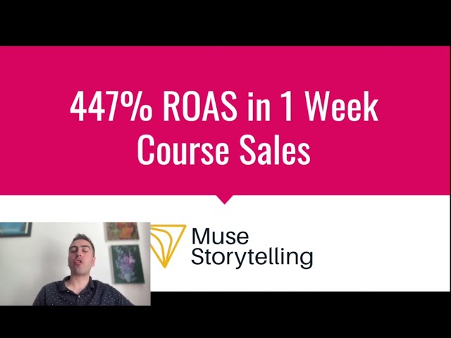
This is all secondary to getting the offer right. I remember one e-commerce client selling subscription boxes. Their page was fine, but conversions were poor. We changed the offer from "Subscribe Now" to "Try Your First Box for 50% Off" and the conversion rate tripled overnight. The page barely changed. The offer changed everything. They ended up with a 1000% return on ad spend. It's that powerfull.
This is the main advice I have for you:
I've detailed my main recommendations for you below in a table to make it a bit clearer. This is the process I'd follow to diagnose and fix a "landing page problem."
| Area of Focus | Problem to Diagnose | Actionable Solution |
|---|---|---|
| 1. Audience & ICP | Are you targeting a vague demographic or a specific, urgent 'nightmare'? Is your targeting too broad? | Redefine your ICP based on their deepest pain point. Identify where they congregate online (forums, specific sites, influencers they follow) and what they search for. This becomes your targeting list. |
| 2. Ad Message | Is your ad copy generic and feature-focused? Does it make a clear promise that resonates with the ICP's nightmare? | Rewrite your ad copy using a proven framework like Problem-Agitate-Solve or Before-After-Bridge. Make it all about them and their transformation. |
| 3. The Offer | Is your offer high-friction ("Request a Demo," "Contact Us") and low-value? Does it ask for commitment before providing value? This is probebly your biggest issue. | Replace it with a low-friction, high-value offer. Brainstorm a free tool, a valuable guide, a free trial, a freemium plan, or a free audit/consultation that solves a small piece of their problem instantly. |
| 4. Landing Page | Is there a disconnect between the ad and the page? Is the page cluttered? Is social proof weak or missing? Is the CTA unclear? | Ensure the headline mirrors the ad's promise. Strip out all navigation and distractions. Add strong, relevant social proof (testimonials, logos). Make the CTA button text match your new, low-friction offer. |
As you can see, this is a systematic process. It requires stepping back from the tactical details and thinking strategically about the entire customer journey. It's not easy, and it takes real expertise to diagnose the weak link in the chain and implement the right fix. Getting a fresh pair of expert eyes on your whole funnel can often uncover the one or two critical changes that make all the difference.
If you work through this process and are still stuck, it might be worth considering some expert help. We offer a completely free, no-obligation initial consultation where we can review your strategy, ads, and landing page together. It's often hugely helpful for people to get that outside perspective and a taste of the expertise that could go into their project.
Hope that helps!
Regards,
Team @ Lukas Holschuh

Lukas Holschuh
Founder, Growth & Advertising Consultant
Great campaigns fail without expertise. Lukas and his team provide the missing strategy, optimizing your entire advertising funnel—from ad creatives and copy to landing page design.
Backed by a proven track record across SaaS, eLearning, and eCommerce, they don't just run ads; they engineer systems that convert. A data-driven partnership focused on tangible revenue growth.