Hi there,
Thanks for reaching out and sharing what you're seeing with your new course launch. It sounds incredibly frustrating to be getting traffic from your Meta and YouTube ads but not seeing it translate into sign-ups. Happy to give you some initial thoughts and guidance based on what you've described.
A conversion rate of 0.5% from paid traffic hitting your landing page is, quite honestly, very low. I know you're seeing engagement on the ad side (clicks, views), which is good in that it suggests the ads are, at least, stopping people scrolling and getting them to click. But that really low conversion rate *after* they click almost always points to a significant bottleneck further down the funnel, rather than just being purely about the ads themselves.
When you see a rate like that, where nearly everyone who arrives on your page leaves without taking the desired action (signing up for the course), the first places I'd look, very closely indeed, are the landing page they're arriving on and the course offer itself. Think of it like this: the ads are getting people to the front door, but something inside the house is making them turn around immediately.
We'll need to look at your landing page specifically...
Based on similar situations I've seen, especially with digital products like courses or software trials, the landing page experience is absolutely crucial. A 0.5% rate suggests either the page isn't relevant to the traffic, it's not persuasive, it lacks trust, or it's simply confusing. For a niche like freelance graphic designers, you have a specific audience with specific problems and aspirations. Your landing page needs to speak directly to them.
Is the copy on the page really dialled in to their pain points? Are you talking about the struggles freelancers face – finding clients, pricing their work, standing out, managing their business side? And then, does the copy clearly articulate how *this specific course* solves those problems and helps them achieve their goals? Generic benefits won't cut it; it needs to feel like it was written just for them. Does it clearly explain the value of the course – what specific skills or outcomes will they gain?
Beyond the copy, think about clarity and design. Is the call to action (CTA) immediately obvious? Is there one primary action you want them to take? "Sign Up Now," "Enroll Here," "Get Instant Access" – whatever it is, it needs to stand out and be repeated strategically throughout the page. Is the overall design clean, professional, and easy to navigate? A cluttered or confusing layout can kill conversions stone dead.
And then there's trust. This is often a massive barrier for new online offers. Why should someone who just clicked an ad from a brand they might not know hand over their details or money? Do you have testimonials? Even if the course is brand new, could you get testimonials from beta testers or people who've benefited from your expertise in other ways (maybe you taught a workshop or mentored someone)? Social proof is incredibly powerful. Do you have a professional 'About Us' section? Links to professional social profiles or a LinkedIn page? Is the website speed reasonable? I remember one campaign we ran for an eCommerce store launch where the website was painfully slow to load and had no trust elements like reviews or proper contact info – the conversion rate was dismal until we fixed those basic things. It might sound simple, but these fundamental issues are often overlooked and cause huge drop-offs.
Let's also scrutinise your course offer...
Following on from the page, the actual course offer itself needs to be compelling. For freelance graphic designers, who are likely very busy and also careful about where they invest their money (and time), the perceived value needs to significantly outweigh the cost and the effort required.
Have you tested different price points? Is there an option to pay in instalments? Are there any bonuses included that add extra value – templates, checklists, access to a private community, Q&A sessions? What about a guarantee? Offering a money-back guarantee if they don't see results within a certain timeframe can significantly reduce the risk for potential students.
For digital products, especially when you're just starting out and don't have hundreds of glowing reviews yet, people can be hesitant to commit fully. This is why things like free trials or taster sessions work well for software, or in your case, maybe offering the first module for free, or a heavily discounted 'introductory' access to a portion of the course content. Giving people a low-risk way to sample the quality and your teaching style can make a huge difference in getting them over the hump to sign up for the full course. You mentioned you're confident in the material, so letting people see that quality firsthand could be key. Without giving a little away, it can be hard to build that initial trust and demonstrate the value.
What about the traffic quality, targeting, and creatives?
While I lean towards the landing page and offer being the primary issue with a 0.5% conversion rate, it's definitely worth considering if your ads are attracting the *wrong* kind of traffic, even if they are getting clicks. Getting clicks is one thing, getting clicks from people who are genuinely qualified and ready to consider buying your course is another.
You mentioned you're targeting freelance graphic designers on Meta and YouTube. Are you confident your targeting settings are precise enough? For example, are you targeting people who identify as freelancers or small business owners? Are you using interest targeting related to advanced design software, freelance marketplaces, graphic design business topics, rather than just broad graphic design interests which might capture students or hobbyists? Have you tested different audience segments to see if one group performs significantly better than others?
Also, are your ad creatives and copy setting the right expectation? Do they clearly communicate that this is a *paid course* for *freelancers* looking to *improve their business/skills*? Or could they be interpreted as promoting a free resource, a general tips video, or something for beginners? If the ad copy/creative is ambiguous or appeals too broadly, you'll get clicks from people who are just curious or looking for free stuff, and they'll bounce immediately from a paid course landing page. It's worth split testing different creative angles and ad copy to see which ones attract not just clicks, but clicks from people who are genuinely interested in a paid solution.
We've had some really solid results running course campaigns on Meta platforms for clients, achieving high ROAS when everything's aligned. Often, it's a process of iterating on the targeting *and* the creative alongside optimising the landing page and offer. You might need to experiment with different value propositions in your ads – maybe focusing on income growth, client acquisition, efficiency, or mastering a specific high-value skill, depending on the course content.
So, how to systematically diagnose this?
Based on the extremely low conversion rate, I'd prioritise your diagnosis like this:
- Landing Page: This is the most likely culprit. Get feedback on your page from actual freelance graphic designers if possible. Critically review your copy, CTA, design, and trust elements against the points above.
- Offer: Is the perceived value strong enough for the price? Are there ways to lower the barrier to entry (free module, trial, guarantee)?
- Ad-to-Page Congruence: Do the ads and the landing page feel like a connected experience? Is the messaging consistent? Are the expectations set by the ad met on the page?
- Targeting/Creative: While improving the page/offer is key, you should also be testing different audience segments and creative variations to see if you can attract higher quality traffic that is more likely to convert once the page is improved.
It sounds like you're doing the right thing by setting up tracking, which is essential. Now it's about drilling down into the qualitative aspects – what's the user experience really like on that page? Does the offer genuinely excite the right person? You could even try some user testing tools where you pay people (ideally target audience members) to navigate your page and give feedback.
Here’s a quick overview of the recommended action points I’d suggest you focus on right now:
| Area | Action Point | Why |
| Landing Page | Review & Rewrite Copy | Ensure it directly addresses freelance graphic designer pain points & benefits of the course. |
| Landing Page | Improve Design & Trust Elements | Make page clean, professional, add testimonials, social proof, contact info. |
| Offer | Evaluate Price & Value | Consider bonuses, guarantees, or a lower-cost entry point (free module/trial). |
| Ad Congruence | Check Messaging Consistency | Make sure ad copy/creative aligns perfectly with landing page copy and offer. |
| Targeting/Creative | Split Test Audiences & Creatives | Attract higher quality traffic that is more likely to convert. |
Ultimately, paid advertising is a system with multiple interconnected parts – the audience, the ad creative, the offer, the landing page, and the overall funnel. A weakness in any one area can significantly impact the performance of the others. With a conversion rate of 0.5%, it strongly suggests the issue lies in how compelling your offering and landing page are to the traffic you're sending there, rather than the ads simply not getting attention.
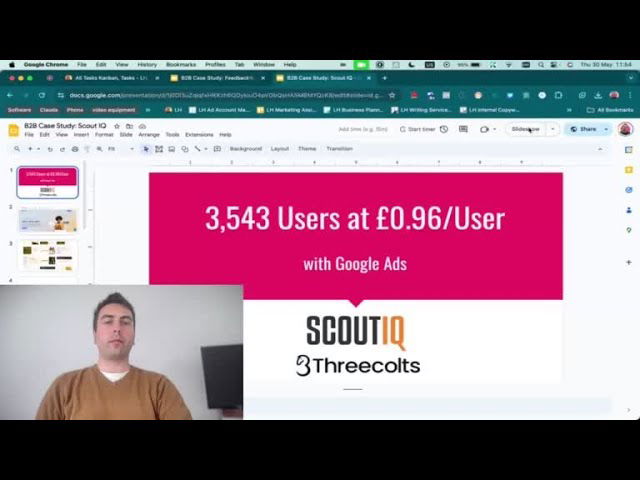
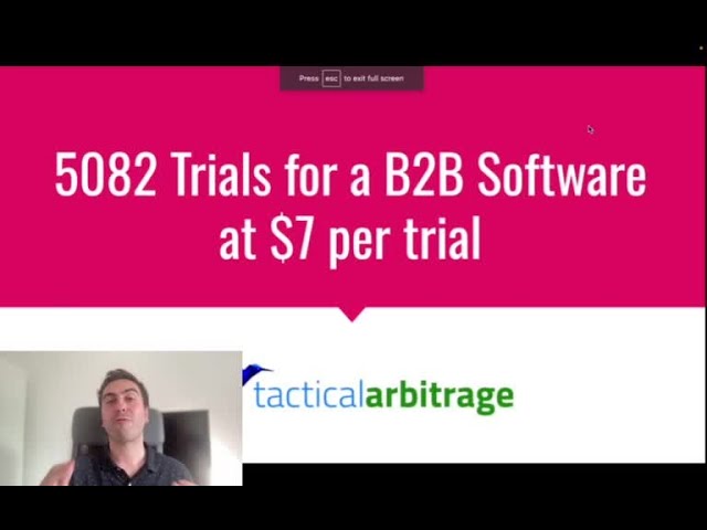
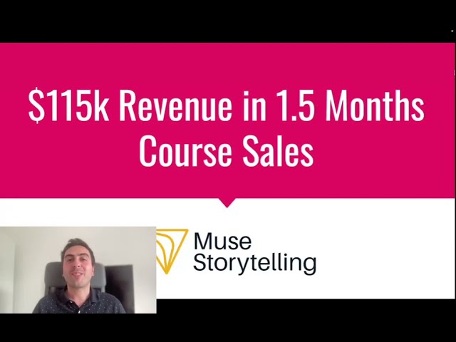
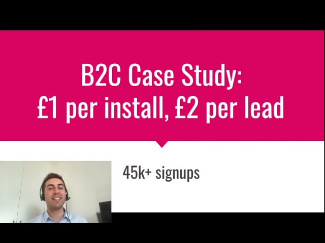
Diagnosing which specific element (copy, design, offer structure, trust) is causing the biggest drop-off requires systematic testing and an experienced eye that's seen these patterns before. It can be tricky to pinpoint exactly what's wrong when you're close to the project, and burning budget on ineffective traffic while you figure it out is painful, I totally get that. Leveraging experience from running campaigns for numerous clients across different niches, including successful course and software launches with strong conversion rates, helps to quickly identify the most probable causes of low performance and prioritise the right fixes.
If you'd like to dive deeper into this and get a more tailored analysis of your specific situation and landing page, we'd be happy to book in a free consultation. We can take a closer look together and provide more specific, actionable recommendations based on our experience with similar businesses.
Regards,
Team @ Lukas Holschuh

Lukas Holschuh
Founder, Growth & Advertising Consultant
Great campaigns fail without expertise. Lukas and his team provide the missing strategy, optimizing your entire advertising funnel—from ad creatives and copy to landing page design.
Backed by a proven track record across SaaS, eLearning, and eCommerce, they don't just run ads; they engineer systems that convert. A data-driven partnership focused on tangible revenue growth.