Hi there,
Thanks for reaching out!
Happy to give you some initial thoughts on your situation. Honestly, from the numbers you've shared, it sounds like a classic case we see quite often. A 3% CTR and a $13.50 cost per purchase on a $70 AOV is actually pretty solid. That's over a 5x return on ad spend right there. So, my gut feeling tells me you're right, the problem isn't likely with your ads or your traffic quality. The ads are getting the right people interested enough to click.
The real issue, the bottleneck that's capping your growth, is almost certainly your website's ability to convert that interest into sales. A 0.8% conversion rate is where all that great work on the ad front is falling apart. We need to figure out why people are clicking but not buying, and plug the leaks in your funnel.
We'll need to look at your customer journey...
First thing's first, we need to become investigators. You need to open up your website analytics, whether that's Google Analytics or the built-in Shopify analytics, and trace the customer's steps. Where are they giving up? This isn't guesswork; the data will tell you exactly where the biggest hole in your bucket is.
You need to look at your conversion funnel report. It usually looks something like this: Visited Site -> Viewed Product -> Added to Cart -> Reached Checkout -> Purchased. You need to see the drop-off percentage at each of these stages.
Here’s what you might find and what it means:
1. Huge Drop-off from 'Visited Site' to 'Viewed Product'?
If you're getting thousands of clicks from your ads but only a tiny fraction ever make it to an actual product page, this points to a few potential culprits:
-> Your Homepage is the Problem: Is it slow to load? People are impatient; a few extra seconds of loading and they're gone forever. Is it cluttered and confusing? If it's not immediately obvious where to go or what you're selling, they'll bounce. Does the 'vibe' of the homepage match the 'vibe' of the ad they just clicked? If there's a disconnect in messaging or visuals, it feels jarring and untrustworthy.
-> Your Targeting is *Slightly* Off: While the ad is good enough to get a click, maybe the audience isn't quite right. For example, you might be attracting people who are curious about your product category but not ready to buy your specific type of product. They land, see it's not quite what they imagined, and leave. You can check this by looking at your Search Terms report in Google Ads (if you're running them) or looking closer at the interests you're targeting on Meta. Is the intent there?
2. Big Drop-off from 'Viewed Product' to 'Added to Cart'?
This is one of the most common issues we see. People are interested enough to look at the details, but something on the product page itself is stopping them from taking the next step. This is where you need to be brutally honest with yourself.
-> Your Product Photos are Rubbish: Sorry to be blunt, but for eCommerce, photos are everything. Are they high-resolution? Do you have multiple angles? Do you show the product in use, with a person (a model or even yourself)? A single, boring photo on a white background isn't enough anymore. I remember one apparel client whose sales shot up after they replaced their flat-lay photos with pictures of real people wearing the clothes. People need to *visualise* themselves using or wearing your product.
-> Your Product Descriptions are Lacking: Do you just list specs, or do you sell the benefit? Nobody buys a drill because they want a drill; they buy it because they want a hole in the wall. What is the 'hole in the wall' your product provides? Your copy needs to be persuasive, answer potential questions, and overcome objections before they even arise.
-> Pricing & Shipping Shock: Is your price clear? Or worse, are you hitting them with unexpectedly high shipping costs only when they get to the checkout? This is a massive conversion killer. Be upfront about shipping costs or, even better, work them into the product price and offer free shipping. It's a huge psychological win.
You need to diagnose this properly. It's the only way to know where to focus your efforts instead of just randomly changing things and hoping for the best.
I'd say you need to build a fortress of trust...
A 0.8% conversion rate screams one thing louder than anything else: a lack of trust. Think about it from a customer's perspective. They've clicked an ad from a brand they've likely never heard of before. They land on a website. They are being asked to hand over their hard-earned money and credit card details. Every fiber of their being is on high alert for scams and disappointment.
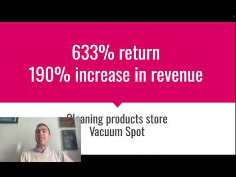
Your website's number one job, before it even tries to sell, is to make that customer feel safe and confident. It needs to look and feel like a legitimate, professional, and trustworthy business. We're running a campaign for a cleaning products company right now, and one of the first things we did was a 'trust audit' of their site. Their ROAS went up by over 190% afterwards. It's that powerful.
Here’s a checklist of things that build trust:
-> Professional Design: Your site can't look like it was made in 1998. It needs a clean, modern design. Consistent branding, good fonts, no clutter. This is non-negotiable. If it looks amateur, people will assume the product and the service are amateur too.
-> Social Proof is Everything: This is probably the most important factor. People trust other people more than they trust you. You need to plaster your site with proof that other real humans have bought from you and were happy.
- Customer Reviews: And not just text reviews. Get reviews with customer photos. If you sell clothing, get photos of customers wearing it. If you sell home goods, get photos of it in their homes. These are a goldmine. Use an app like Loox or Yotpo to collect and display these prominently on your product pages.
- Testimonials: A few glowing quotes on the homepage can work wonders.
- "As Seen In" Logos: Have you been featured in a blog or a local paper? Put their logo on your site. It lends third-party credibility.
-> Crystal Clear Contact Information: A shady business hides how to contact them. A trustworthy one makes it easy. You should have a visible email address, a phone number (even if it goes to voicemail), and ideally, a physical address or PO Box. A dedicated "Contact Us" page is essential.
-> An "About Us" Story: People connect with people, not faceless corporations. Tell your story. Why did you start this business? Who are you? A picture of you, the founder, can increase conversion rates. It makes the whole operation feel more human and less risky.
-> Trust Badges: These are the little logos that people subconsciously look for. Secure payment icons (Visa, Mastercard, PayPal), a money-back guarantee badge, a free shipping badge. They might seem small, but they work by reassuring the customer at the critical moment of decision.
Go through your website right now and score yourself on these points. I'd wager there are a few gaps, and each one you fill will get you closer to a healthier conversion rate.
You probably should re-engineer your message...
Okay, let's get a bit more advanced. Your product pages aren't just a place to list features. They're a sales pitch. And right now, that pitch isn't landing. The number one reason campaigns fail, even with good traffic, is a weak offer or message. It's not connecting with the customer's real, deep-down motivation.
We need to stop selling the *product* and start selling the *transformation*. You need to use a framework I drill into all our clients: the Before-After-Bridge.
The Before State: This is your customer’s world right now. It's filled with a problem, a frustration, a pain point. Your copy needs to describe this world so accurately that the customer nods along and thinks, "Wow, they really get me."
The After State: This is the dream world. It's how their life will be better, easier, or more enjoyable after they use your product. You need to paint a vivid picture of this promised land.
The Bridge: This is your product. It's the simple, clear path from the frustrating 'Before' to the amazing 'After'.
Let's imagine you sell high-quality, sustainable coffee beans. A bad product description would be:
"Our Colombian Supremo beans are single-origin, medium roast. 250g bag. Notes of chocolate and citrus."
It's boring, full of jargon, and sells nothing. Now let's use the Before-After-Bridge:
(Before) "Tired of that bitter, burnt-tasting supermarket coffee that leaves you feeling jittery and unsatisfied? Another morning routine that feels more like a chore than a pleasure."
(After) "Imagine starting your day with a perfectly balanced, incredibly smooth cup of coffee. The rich, deep aroma fills your kitchen, and each sip is a moment of pure bliss, giving you the calm, focused energy you need to conquer your day."
(Bridge) "Our Colombian Supremo beans are the bridge to that perfect morning. Sourced directly from sustainable farms and roasted to perfection, they unlock a world of flavour you just can't find on a supermarket shelf. Click 'Add to Cart' and transform your morning ritual."
See the difference? One sells specs, the other sells an experience. You need to go through every single one of your product descriptions and rewrite them using this framework. Speak directly to the pain and the desire of your customer.
You'll need a proper retargeting funnel...
Right now, you're treating every website visitor the same. Someone who just landed on your homepage is getting the same experience as someone who abandoned a full shopping cart. This is a massive mistake. With a 0.8% conversion rate, 99.2% of your hard-won, expensive traffic is leaving without buying. We need to go after them.
This is where a multi-layered retargeting strategy on Meta (Facebook & Instagram) comes in. You need to segment your visitors based on how far they got down the funnel and show them different, highly relevant ads to pull them back in. This is how you plug the leaks. I often see clients only running top-of-funnel campaigns and ignoring the goldmine in their abandoned carts. Here's how we'd structure it:
| Funnel Stage | Audience (Who to Target) | Ad Message (What to Show Them) |
|---|---|---|
| MoFu (Middle of Funnel) - The Curious |
-> All Website Visitors in last 30 days (excluding purchasers) -> People who viewed a Product Page but didn't Add to Cart |
Don't just show them the same product ad again. They've seen it. You need to build more trust and desire. -> Show a video testimonial from a happy customer. -> Show user-generated content (photos of customers with your product). -> Show a carousel ad highlighting different benefits or uses of the product they viewed. |
| BoFu (Bottom of Funnel) - The Almost-There |
-> People who Added to Cart in last 7-14 days (excluding purchasers) -> People who Initiated Checkout in last 7-14 days (excluding purchasers) |
These people were *this close* to buying. Something stopped them. It could be price, distraction, or a last-minute doubt. Your job is to gently nudge them over the line. -> Use Dynamic Product Ads (DPA) to show them the exact item they left in their cart. -> Offer a small, time-sensitive incentive: "Still thinking it over? Complete your purchase in the next 24 hours and get 10% off." -> Remind them of your key value props: "Don't forget, we offer free shipping and a 30-day money-back guarantee!" |
Setting this up is not optional; it is fundemental to running a profitable eCommerce business. It automates the process of recovering potentially lost sales. A good retargeting funnel can easily add an extra 10-20% to your monthly revenue, if not more, from the same ad spend you're already using.
I've detailed my main recommendations for you below:
| Action Item | Description | Why It's Important |
|---|---|---|
| 1. Funnel Analysis | Use your website's analytics to identify the single biggest drop-off point between 'Visit', 'Product View', 'Add to Cart', and 'Purchase'. | Stops you from guessing and allows you to focus all your energy on fixing the weakest link in the chain first for the biggest impact. |
| 2. Website Trust Audit | Add high-quality product photos, customer reviews (with images), clear contact details, trust badges, and an 'About Us' page. | Directly combats the primary reason for low conversion rates: a lack of trust. Makes new visitors feel safe buying from you. |
| 3. Copywriting Overhaul | Rewrite your key product descriptions using the 'Before-After-Bridge' framework. Focus on the transformation, not just the features. | Creates an emotional connection and makes your product feel like the solution to a real problem, not just another item for sale. |
| 4. Build a Retargeting Funnel | Create separate MoFu (visitor retargeting) and BoFu (cart abandoner) campaigns on Meta with tailored ad messaging for each. | Recovers a significant percentage of the 99.2% of visitors who leave without buying, dramatically increasing your overall ROAS. |
As you can see, turning that 0.8% conversion rate into a 2%, 3%, or even 4% rate isn't about one magic bullet. It's about systematically identifying and fixing every point of friction and doubt in your customer's journey. It's detailed, specialist work that combines data analysis, psychology, and marketing strategy.
Doing this all on your own can be a slow, expensive process of trial and error. Getting it wrong means continuing to pour money into ads that don't fully convert. Getting it right, however, is what separates struggling stores from seven-figure brands.
If you'd like an expert eye on this, we offer a free, no-obligation strategy session where we can go through your actual website and analytics together. We can help you pinpoint the exact issues and lay out a clear action plan. It might be the most valuable 20 minutes you spend on your business this year.
Regards,
Team @ Lukas Holschuh

Lukas Holschuh
Founder, Growth & Advertising Consultant
Great campaigns fail without expertise. Lukas and his team provide the missing strategy, optimizing your entire advertising funnel—from ad creatives and copy to landing page design.
Backed by a proven track record across SaaS, eLearning, and eCommerce, they don't just run ads; they engineer systems that convert. A data-driven partnership focused on tangible revenue growth.