You're burning money on paid ads. It's a tough pill to swallow, but let's be honest. You've spent weeks, maybe months, getting your Google Ads or Meta campaigns just right. You've A/B tested your ad creative, you've dialled in your targeting, and people are finally clicking. But then... nothing. A trickle of low-quality leads, a handful of abandoned carts, and a ROAS that makes you want to turn the whole thing off. The clicks are there, but the conversions aren't. And the temptation is to blame the ad platform. To blame the algorithm. To blame the targeting. But I'll tell you right now, in 9 out of 10 cases I see, the problem isn't your ads. It's your landing page.
That click is not a victory. It's a baton pass. Your ad makes a promise, and your landing page has one job: to deliver on that promise so convincingly that the visitor has no other choice but to convert. Most landing pages are unfocused, untrustworthy, and unclear. They are digital graveyards for expensive ad traffic. This guide is the blueprint to change that. We're going to tear down the common mistakes and build a landing page that doesn't just get clicks, it gets customers. No jargon, no fluff, just the straight-talking process we use to turn ad spend into actual profit.
So, why are my ads really failing?
Let's get one thing straight. The most common reason paid ad campaigns fail has very little to do with the ads themselves. You can have the most persuasive ad copy in the world, an image that stops the scroll dead, and targeting so precise it feels like magic. But if that ad click leads to a landing page that is slow, confusing, or doesn't instantly continue the conversation started in the ad, you've lost. You've paid for a visitor, only to slam the door in their face.
This disconnect is called a lack of 'message match'. Think about it. A user sees your ad promising a solution to their specific, urgent problem. "Tired of unpredictable cash flow? Get a clear financial forecast in 24 hours." They click, full of hope. Then they land on your generic homepage, with a navigation bar listing ten different services, a vague headline like "Financial Consulting for the Modern Business," and a stock photo of people in a boardroom. The promise is broken. The user is confused, their trust evaporates, and they hit the back button in under three seconds. You just paid Google or Facebook for that bounce. It's a scenario I see constantly with businesses that complain about high bounce rates from their Meta ads.
A successful landing page is a specialist, not a generalist. Its only purpose is to serve the paid ad campaign it's linked to. It should feel like the second half of the same sentence. The headline on the page should echo the headline in the ad. The imagery should be consistent. The core problem you mentioned in the ad should be the very first thing they see addressed on the page. This seamless transition is not a 'nice to have'; it's the absolute foundation of a profitable campaign. Without it, you're just funding the ad platforms with no return. You might get a high CTR and lots of traffic, but you'll get no sales from your Facebook ads, and you'll be left scratching your head wondering why.
Before you design anything, you need to define your offer
This is the part everyone wants to skip, and it's the biggest mistake you can make. Before you even think about headlines, colours, or buttons, you have to nail your offer. And I don't just mean "we sell X" or "we provide Y service." A powerful offer is built on a deep, almost obsessive, understanding of your customer's pain.
Forget your old ICP document. "B2B companies with 50-200 employees" is not a customer profile; it's a lazy demographic. It tells you nothing. You need to define your ideal customer by their nightmare. What keeps them up at night? What's the expensive, urgent, career-limiting problem they are desperate to solve? Your Head of Sales client isn't just a job title; she's terrified of missing her quarterly target because her team is buried in manual data entry instead of selling. Your offer isn't "CRM implementation"; it's "Give your sales team 10 hours back a week."
Once you've identified that nightmare, you can build your offer around it. The best offers are specific, tangible, and solve that one, burning problem. A great example I saw recently was a video production company. They used to sell "corporate videos." Generic, right? No one wakes up thinking "I need a corporate video." They changed their offer. They targeted fast-growing tech startups who were great at building products but terrible at explaining them. Their new offer: "We'll turn your complex software into a 90-second demo video that actually closes deals." See the difference? They identified a specific audience (tech startups), an urgent problem (sales struggling to explain the product), and created a tangible solution. That's an offer people will pay for.
This process of identifying pain and creating a specific solution is the engine of any succesful campaign. It’s what separates the campaigns that generate thousands of trials from those that barely get a signup. I remember one B2B SaaS client who came to us struggling. They had a powerful product but a generic message. We helped them refocus their offer around a single, painful problem for their target user, which led to us generating over 1,500 trials for them through Meta Ads alone. The ads worked because the offer was finally right.
The Anatomy of a Landing Page That Actually Converts
Alright, you've nailed your offer. You know who you're talking to and the specific pain you're solving. Now, and only now, can you start building the page itself. A high-converting landing page isn't a beautiful work of art (though good design helps). It's a ruthlessly efficient conversion machine. Every element has a job to do. Let's break it down.
1. The Headline: Your First and Last Chance
Most people will only read your headline. If it doesn't grab them by the collar and speak directly to their problem, they're gone. Your headline must do two things instantly: acknowledge their pain and promise a better future. It should be an evolution of your ad headline.
-> Bad Headline: "Innovative FinOps Solutions" (What does that even mean? It's jargon.)
-> Good Headline: "Stop Wasting Money on AWS. Find and Eliminate Hidden Cloud Costs in 10 Minutes." (Specific problem, specific promise, clear benefit.)
Your sub-headline then expands on this promise, adding a bit more detail or a key benefit. For the example above, a good sub-headline might be: "Our platform connects to your cloud account and gives you an actionable list of savings opportunities, no engineer required." It overcomes a potential objection ("this sounds too technical for me") right away.
2. The Hero Section: Show, Don't Just Tell
This is the top section of your page, containing your headline, sub-headline, and usually an image or video, plus the main Call to Action (CTA) button. The visual element is critical. Ditch the generic stock photos. Show your product in action. If it's software, use a clean screenshot or a short GIF of the 'aha!' moment. If it's a service, show a picture of the result, or a professional photo of the person they'll be speaking to. For e-commerce, it has to be a high-quality, aspirational shot of the product being used. The goal is to make the promised outcome feel real and attainable.
3. The Body Copy: Tell a Story with Problem-Agitate-Solve
Now you guide them down the page. Don't list features. Nobody cares that your software is "built on a robust Python framework." They care about what it does for them. Use a simple but powerful copywriting formula like Problem-Agitate-Solve (PAS).
-> Problem: Start by stating the problem they know all too well. "Another month, another surprise AWS bill that's 30% higher than the last. You ask your engineers what happened, and all you get is a shrug."
-> Agitate: Pour a little salt in the wound. Make the pain more vivid. "So you're stuck. You can't slow down development, but you're burning through cash with no visibility or control. Every pound you waste is a pound you can't spend on hiring or markeing."
-> Solve: Introduce your product as the clear, obvious solution. "Imagine opening your cloud bill and smiling. You see exactly where every penny is going. Waste is flagged automatically. That's what our platform does. It's the bridge from financial chaos to predictable growth."
This narrative structure is far more persuasive than a dry list of bullet points. It connects on an emotional level before it presents the logical solution.
4. Social Proof: The Antidote to Scepticism
No one believes what you say about yourself. They believe what other people say about you. Social proof is non-negotiable. You need to layer it throughout your landing page. Here are the most effective types:
-> Direct Testimonials: Quotes from happy customers. The best ones are specific. Instead of "Great service!", use "Their tool helped us reduce our server costs by 22% in the first month." Include a name, company, and photo for maximum credibility.
-> Client Success Stories: A more detailed story of how you helped a client. This is particulalry powerful for B2B. We feature client success stories prominently because they show we've done this before, such as how we helped an environmental controls company reduce their cost per lead by 84%.
-> Logos of Companies You've Worked With: This is a quick, visual way to build trust, especially if you have recognisable brands.
-> Reviews & Ratings: If you sell on platforms like Trustpilot, Capterra, or even have Google Reviews, embed those widgets. Star ratings are a powerful visual shortcut for trust.
-> Data-based proof: This can be anything from 'Join 10,000+ satisfied customers' to 'Our clients save an average of £500 a month'. These specific numbers add a lot of weight to your claims.
5. The Call to Action (CTA): Make it Irresistible
This is where the magic happens. Your CTA is not just a button; it's the final instruction. The text on the button should be benefit-oriented. Instead of "Submit," use "Get My Free Audit." Instead of "Download," use "Show Me My Savings." But the button itself is only half the battle. The offer behind the button is what truly matters, which brings us to our next, and perhaps most important, point.
Delete Your "Request a Demo" Button. Seriously.
This is probably the most contrarian piece of advice I give, and the one that delivers the biggest results. The "Request a Demo" or "Contact Sales" button is the single biggest conversion killer in B2B advertising. It is an arrogant, high-friction, low-value ask.
Think about it from your prospect's point of view. They are a busy, important person. You are asking them to commit their valuable time to a meeting where they know they will be sold to. It screams, "I want to take up your time to tell you how great I am." It presumes they have nothing better to do. This is why your conversion rates are terrible. For any business, but especially for new SaaS companies, a high-friction CTA can be the reason you're seeing low signups despite having a great freemium model.
Your offer's only job is to deliver a moment of undeniable value—an "aha!" moment that makes the prospect sell themselves on your solution. You must solve a small, real problem for them, for free, to earn the right to solve their bigger problems for money.
What does this look like in practice?
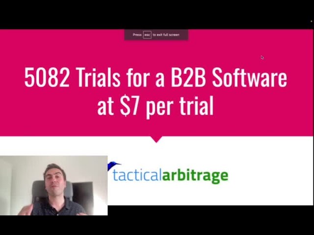
-> For B2B SaaS: This is your superpower. The gold standard is a free trial (no credit card required) or a freemium plan. Let them get their hands on the actual product. Let them experience the transformation for themselves. When the product proves its own value, the sale becomes a formality. One of our most successful campaigns drove 5,082 software trials on Meta Ads because the offer was simple: "Try it free for 14 days." No demo, no sales call, just instant value.
-> For Service Businesses: You're not exempt. You have to "productise" your expertise into a high-value, low-friction offer. A marketing agency could offer a "Free 5-Point SEO Audit" that automatically shows a prospect their top keyword opportunities. A financial consultant could offer a "Cash Flow Projection Template." As a B2B ads consultancy, our offer is a free 20-minute strategy session where we audit failing ad campaigns. We provide real, actionable advice for free, which demonstrates our expertise far more effectively than any sales pitch could. If you run a local service business, this principle is even more important for generating qualified leads. Your blueprint should be about giving value upfront, which is a core part of our approach for local lead generation.
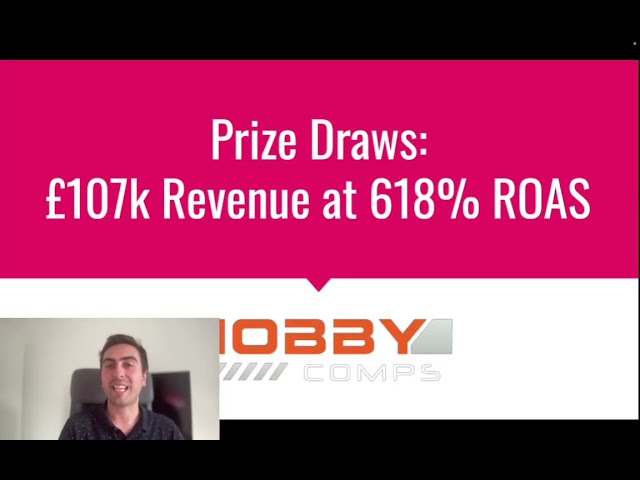
-> For E-commerce: The friction is lower, but the principle is the same. The "offer" is often a discount, but you can be more creative. "Get 10% off your first order" is standard. What about "Take our 30-second quiz to find your perfect shade"? Or "Get a free sample with any purchase"? You're lowering the risk and adding value beyond just the transaction. A great offer can be the difference between a failing store and one that achieves a 1000% ROAS, as we saw with one of our subscription box clients.
By shifting from a high-friction "ask" to a high-value "give," you fundamentally change the dynamic. You move from being a vendor begging for time to a trusted advisor providing value. This is the secret to turning expensive clicks into profitable customers.
The Technicals: Don't Let Your Page Sabotage You
You can have the best offer and the most persuasive copy in the world, but if your landing page fails on a technical level, you're dead in the water. These are the boring but absolutely essentail bits that so many people get wrong.
Page Load Speed is a Conversion Killer
Every extra second your page takes to load, you lose visitors. In the world of paid ads, you're paying for every single one of those visitors. A slow page is literally like setting your ad budget on fire. Google has stated that as page load time goes from 1 second to 5 seconds, the probability of a bounce increases by 90%. Your page needs to be fast. Especially on mobile. Use Google's PageSpeed Insights tool. It's free. It will tell you exactly what's slowing your page down—oversized images are the usual suspect. Compress them. Lazy load them. Do whatever it takes. A fast page feels professional and respectful of the user's time. A slow one feels amateurish and frustrating.
Mobile-First is Non-Negotiable
Well over half of your ad traffic, possibly as high as 80-90% for platforms like Meta and TikTok, will come from mobile devices. Your landing page cannot just be "mobile-friendly"; it must be designed for mobile first. This means:
-> Big, easy-to-tap buttons.
-> Large, readable font sizes. No squinting.
-> Simple, single-column layouts.
-> Forms with as few fields as possible.
-> Click-to-call phone numbers for service businesses.
Open your landing page on your own phone. Try to go through the conversion process. Is it easy? Is it frustrating? Be brutally honest. If it's a pain for you, it's a nightmare for a potential customer.
If You Can't Measure It, You Can't Improve It
This is my final rant. You absolutely must have robust conversion tracking in place. This means having your Meta Pixel or Google Ads Conversion Tag installed correctly and firing on the thank you page or for the key conversion event. Without accurate data, you are flying blind. You won't know which ads, which audiences, or which landing page variations are working. You'll be making decisions based on gut feelings, and that's a terrible way to manage an ad budget.
Proper tracking allows you to see the real ROI of your campaigns, not just the vanity metrics the ad platforms want you to see. It can be tricky, especially with things like iOS updates and some website platforms, and sometimes you need to deal with pixel tracking limitations, but it's not optional. You need to understand your numbers. What's your cost per lead? Your cost per acquisition? What's your landing page conversion rate? Getting this right allows you to unmask your true ad ROI and make intelligent, data-driven decisions to scale your business.
The Blueprint: Your Actionable Checklist
We've covered a lot of ground. It can feel like a lot to take in, which is why I've boiled it down into a simple blueprint. Use this as your checklist when building your next landing page or auditing an existing one. Getting these elements right is the core of our entire process and the foundation of any succesful campaign. It's the ultimate guide to fixing a failing ad campaign.
This is the main advice I have for you:
| Component | Best Practice / The Rule | Why It Matters (The Brutal Truth) |
|---|---|---|
| Message Match | Headline, imagery, and offer on the page must directly match the ad that was clicked. | A mismatch breaks trust instantly. The user feels tricked or confused and bounces. You paid for that bounce. |
| Headline | Address the user's main pain point and promise a clear, desirable outcome. No jargon. | This is 80% of the battle. If your headline is weak, nothing else on the page will even get read. |
| The Offer / CTA | Offer high value and low friction. Replace "Request a Demo" with a free trial, tool, audit, or tangible asset. | "Request a Demo" is an arrogant ask. A high-value giveaway positions you as an expert and builds trust before asking for a sale. |
| Body Copy | Focus on benefits, not features. Use a story-based formula like Problem-Agitate-Solve. | People buy on emotion and justify with logic. Your copy needs to connect with their pain before presenting your solution. |
| Social Proof | Layer multiple types of proof: specific testimonials, client success stories, logos, reviews, data points. | Nobody believes you. They believe your customers. Without proof, your claims are just empty promises. |
| Design & Layout | Clean, simple, single-column layout. No distractions. Remove the main site navigation. | A landing page has one goal. Any link that doesn't lead to a convresion (like a link to your 'About' page) is a potential exit point you're paying for. |
| Page Speed | Must load in under 3 seconds, especially on mobile. Optimise all images. | A slow page is the digital equivalent of a shop with a locked door. It creates frustration and kills conversions before you've even had a chance. |
| Tracking | Install conversion pixels/tags correctly and test them. Track the one metric that matters. | Without data, you're just guessing. Accurate tracking is the only way to know what's working and how to scale profitably. |
From Theory to Profit: Real-World Examples
This blueprint isn't just theory. It's the foundation of the results we get for our clients every single day. The difference between a generic website and a dedicated, high-converting landing page is stark.
Take B2B software, a notoriously difficult space. Many founders come to us after failing with ads. They direct traffic to their homepage, which talks all about their company history and has a dozen different CTAs. We come in, build a dedicated landing page following this blueprint, focused on a single pain point and offering a frictionless free trial. The result? For one B2B SaaS client, we generated 4,622 registrations at just $2.38 each. For another, we took their Cost Per User Acquisition from a crippling £100 down to a profitable £7. This wasn't magic; it was a focused landing page with a proper offer.
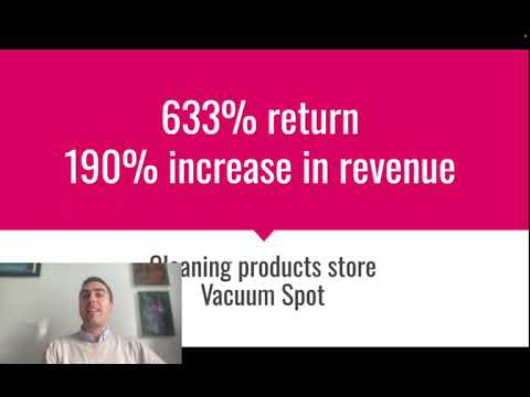
It's the same story in e-commerce. A cluttered product page with a weak description won't cut it for cold ad traffic. We worked with a women's apparel brand, created campaign-specific landing pages that focused on a single collection, used strong lifestyle imagery, and layered customer reviews heavily. The result was a 691% Return On Ad Spend. For another e-commerce brand selling cleaning products, a similar approach led to a 633% return. The common thread is always a dedicated page that continues the ad's conversation and makes the decision to buy simple and compelling. This is the core of our e-commerce game plan on Meta.
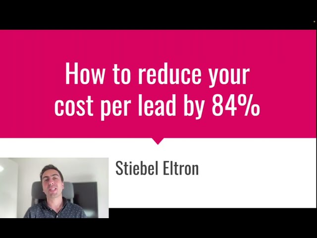
This even works for high-ticket, complex sales. We helped an environmental controls company that was struggling to get leads. Their website was an engineering marvel, full of technical specs. We created a landing page that ignored the specs and instead focused on the pain point: "Worried about failing an emissions audit?". The offer wasn't "Contact Us," it was "Download Our Free Pre-Audit Checklist." This simple shift, from selling to helping, reduced their cost per lead by 84%. The landing page did the hard work of qualifying and educating visitors, so the sales team only spoke to people who already understood the value.
What To Do When You're Still Stuck
Following this blueprint will put you ahead of 90% of your competitors. It will force you to clarify your offer, understand your customer's pain, and build a focused conversion machine instead of a generic digital brochure. It will stop you from burning money on clicks that go nowhere.
But sometimes, even with the right blueprint, building the house is hard. You might struggle to write copy that connects. You might not be sure which pain point to focus on. Your design might not be building the trust you need. Or maybe the technical side of tracking and page speed feels overwhelming.
That's perfectly normal. Getting this right is a combination of art and science, and it takes experience to fine-tune all the elements to work together perfectly. It's why we exist. This isn't just about building a page; it's about building a predictable system for turning ad spend into growth.
If you've followed this guide, implemented the changes, and feel like you're close but not quite there, it might be time for an expert eye. We live and breathe this stuff every day. We've seen what works and what doesn't across hundreds of campaigns and millions in ad spend. If you'd like a second opinion on your landing page and ad strategy, we offer a completely free, no-obligation strategy session where we can take a look at what you're doing and give you some actionable advice. Sometimes a 20-minute conversation is all it takes to find the one or two key levers that can unlock your campaign's true potential.

Lukas Holschuh
Founder, Growth & Advertising Consultant
Great campaigns fail without expertise. Lukas and his team provide the missing strategy, optimizing your entire advertising funnel—from ad creatives and copy to landing page design.
Backed by a proven track record across SaaS, eLearning, and eCommerce, they don't just run ads; they engineer systems that convert. A data-driven partnership focused on tangible revenue growth.