TLDR;
- Stop obsessing over button colours and A/B testing fonts. Your landing page is probably failing because your offer is weak and your message is generic. This is a strategy problem, not a design problem.
- Your ads make a promise; your landing page must deliver on it instantly. This concept, known as 'message match', is the single biggest factor in reducing bounce rates and converting expensive clicks.
- Delete the "Request a Demo" button. It's an arrogant, high-friction CTA that kills conversions. Replace it with a high-value, low-friction offer that solves a small piece of your customer's 'nightmare' for free.
- The most important metric you're not tracking is your Customer Lifetime Value (LTV). It tells you how much you can truly afford to spend to acquire a customer, which dictates your entire landing page strategy. This article includes an interactive calculator to help you find your number.
- This playbook contains a 'Funnel Leak Detector' diagram to help you diagnose exactly where your landing page is failing, from a low click-through rate on the ad to a high cart abandonment rate in the checkout.
You’ve spent weeks, maybe months, perfecting your paid ad campaigns. You've agonised over keywords, audiences, and ad copy. The clicks are finally coming in. But there's a huge, expensive problem: nobody is converting. Your ad spend is climbing, but your sales and leads are flatlining. So you do what everyone tells you to do: you start "optimising" your landing page. You change the button colour from blue to green. You A/B test a new headline. You move the testimonial from the left side to the right. And nothing changes.
Let's be brutally honest. The reason you're stuck is because you're trying to fix a broken leg with a plaster. The entire conversation around landing page optimisation is a massive distraction, focused on tactical minutiae while completely ignoring the strategic blunders that are actually costing you a fortune. Your landing page isn't failing because you chose the wrong shade of green. It's failing because what you're offering is uninspired, your message is talking to the wrong person about the wrong problem, and your page doesn't build an ounce of trust.
Paid traffic is the most impatient, most skeptical traffic you will ever get. These people don't know you. They clicked your ad on a whim, and you have about three seconds to convince them they didn't make a mistake. If your page doesn't instantly deliver on the promise of your ad and solve their problem, they're gone. And you just paid for the privilege of disappointing them.
This playbook is about throwing out the nonsense and focusing on what actually moves the needle. We're not going to start with design trends. We're going to start where every successful conversion begins: with a deep, almost uncomfortable understanding of your customer's pain and an offer so compelling they'd feel stupid for saying no.
Why is my expensive ad traffic not converting? (It's not your button colour)
Before you can fix the problem, you need to correctly diagnose it. Most people see a low conversion rate and jump to the wrong conclusion. They think, "My landing page is broken." The truth is usually more nuanced. A landing page isn't a standalone entity; it's the final link in a chain that starts with your ad. If the chain is broken, it's often because a link further up the chain is weak.
Think of it like this: your ad is a promise, and your landing page is the fulfillment of that promise. When a user clicks, they have a very specific expectation in their head, set by the ad they just saw. If your landing page doesn't match that expectation *instantly*, you create cognitive dissonance. It's a fancy way of saying you confuse them. And a confused mind always says no. They hit the back button, and your Quality Score on Google drops, your ad costs go up, and the whole cycle of failure continues.
Tbh, paid advertising just amplifies what you already have. If you have a brilliant, high-converting offer and a website that builds trust, ads will pour fuel on that fire and your business will grow. If you have a confusing offer, a generic message, and an untrustworthy website, ads will just help you burn through your cash faster than ever before. It's a leaky bucket. Pouring more water (traffic) into a leaky bucket doesn't fix the problem. You have to patch the holes first. Most of those holes aren't technical; they're strategic. They're about what you're saying and who you're saying it to.
So before you change a single pixel on your page, you need to answer a much more important question: who are you really talking to, and what is the painful, expensive problem you're promising to solve for them?
Are you solving a 'headache' or a 'bleeding neck' problem?
This is the absolute foundation. If you get this wrong, nothing else matters. Most businesses define their customer using sterile, useless demographics. "We target marketing managers at tech companies with 50-200 employees." This tells you nothing of value. It forces you to write landing page copy that's generic and bland, like "The Ultimate Marketing Automation Platform". It speaks to no one.
To write a landing page that converts, you must define your customer by their pain. Specifically, their 'nightmare'. What is the urgent, expensive, career-threatening problem that keeps them awake at night? Your landing page headline's only job is to reflect that nightmare back at them, so they feel seen and understood.
Your Ideal Customer Profile (ICP) isn't a person; it's a problem state.
- For a legal tech SaaS: The nightmare isn't 'needing document management'. It's 'a senior partner missing a critical filing deadline, exposing the firm to a multi-million-pound malpractice suit.'
- For an e-commerce brand selling ergonomic office chairs: The nightmare isn't 'needing a new chair'. It's 'a freelance developer whose crippling back pain is so bad they can't code for more than two hours, threatening their ability to hit deadlines and pay their mortgage.'
When you understand the nightmare, your landing page copy shifts dramatically. Instead of a headline about your product, you write a headline about their problem.
The Generic Way
Headline: "The #1 Project Management Tool"
Result: Ignored. It's about you, not them.
The 'Nightmare' Way
Headline: "Tired of Project Deadlines Slipping? Stop Chasing Status Updates."
Result: Resonates instantly with their pain.
The rest of your landing page copy should then follow a proven formula. The two most effective for paid traffic are:
1. Problem-Agitate-Solve (PAS): This is perfect for service businesses or products solving a complex problem.
- Problem: "Are your cash flow projections just a shot in the dark?" (You've stated their nightmare)
- Agitate: "One bad month could mean a payroll crisis, while your competitors are confidently raising their next round of funding." (You've twisted the knife by highlighting the consequences)
- Solve: "Get expert financial strategy for a fraction of a full-time hire. We build dashboards that turn uncertainty into predictable growth." (You've presented your offer as the logical solution)
2. Before-After-Bridge (BAB): This is brilliant for SaaS and e-commerce products that create a tangible transformation.
- Before: "Another Monday morning, another dozen emails from the CEO asking for status updates. Your team is busy, but are they busy on the right things?" (You've painted a picture of their current, frustrating reality)
- After: "Imagine opening your dashboard and seeing every project is on track, in one place. No more chasing. No more chaos." (You've shown them the promised land)
- Bridge: "Our platform is the bridge that gets you there. Start your free trial and have your most productive week ever." (You've positioned your product as the simple path to the 'after' state)
This isn't just about clever copywriting. It's a strategic decision to make your entire landing page about the customer's world, not your own. When you get this right, you don't need to worry about button colours, because you've already won their attention and interest by proving that you understand their problem better than anyone else. This deep understanding is the key to crafting a value proposition that actually resonates.
Why your "Request a Demo" button is the most expensive CTA on your website
Okay, you've nailed the headline and the copy. Your prospect is nodding along, thinking "Yes, that's exactly my problem!". They scroll down to your call-to-action... and it's a "Request a Demo" button. And just like that, you've lost them.
The "Request a Demo" button is quite possibly the most arrogant and ineffective Call to Action in the history of marketing, especially for cold traffic from an ad. Think about the psychology. You are asking a busy, skeptical stranger to:
- Hand over their personal contact information.
- Commit to a 30-60 minute meeting in their already packed calendar.
- Willingly subject themselves to a sales pitch from one of your reps.
This is a massive ask. It's all friction and no immediate value for them. It presumes they are already sold on your solution and are ready for a sales conversation. But they're not. They've just arrived from an ad. They're still figuring out if you're even credible. This CTA creates a huge wall right at the point of conversion. For an even more in-depth breakdown of this, our guide on B2B ad creative strategies goes into why this offer fails so consistently.
Your offer's only job is to provide an "aha!" moment of undeniable value, instantly. It needs to be a no-brainer. You must solve a small, real problem for them for free, to earn the right to solve their bigger problems for money.
For SaaS, the gold standard is a free trial (no credit card required) or a freemium plan. Let them use the product. Let them experience the transformation you promised in your copy. When they see for themselves that your software solves their problem, the sale becomes a formality. You're creating Product Qualified Leads (PQLs) who are already convinced.
For service businesses, you have to productise your expertise.
- Agency? Offer a free, automated SEO audit that finds their top 3 keyword opportunities.
- Consultancy? Offer a free 15-minute video training on the #1 mistake in your industry.
- For us, as a paid ads consultancy? We offer a free 20-minute strategy session where we audit a company's failing ad campaigns and give them actionable advice.
Your offer needs to be so good, people would feel stupid saying no. It's the lynchpin of a campaign. A brilliant ad pointing to a weak offer will always fail. A mediocre ad pointing to an irresistible offer can still be wildly successful.
The unbreakable rule: Does your landing page keep the promise of your ad?
This is a simple concept, but it's where countless campaigns fall apart. It's called 'message match'. The headline of your landing page should be a direct continuation of the headline or core promise of your ad. The imagery should be consistent. The offer should be identical.
If your ad says "Get a Free Website SEO Audit," your landing page headline had better be "Get Your Free Website SEO Audit in 60 Seconds," not "The #1 Digital Marketing Agency." If your ad features a picture of a smiling woman using your product, the landing page hero image should feature the same woman. This creates a seamless, reassuring experience for the user. It tells them they're in the right place.
When there's a disconnect, it creates immediate distrust. The user feels like they've been tricked. It's a classic bait-and-switch. And what do they do? They hit the back button. Your bounce rate skyrockets, your Google Ads Quality Score plummets (making your clicks more expensive), and your conversion rate dies. Tbh, a high bounce rate on ad traffic is almost always a symptom of poor message match. You paid for the click; don't waste it by confusing the user the second they arrive. For a deeper dive on this, our guide to writing high-conversion Google Ads copy explains how to build this consistency from the keyword up.
How much can you actually afford to spend to get a conversion?
This is where we connect landing page performance directly to your business's bottom line. Most founders think about their ad budget in a vacuum. But a great landing page can fundamentally change the economics of your entire business.
The key is to stop thinking about Cost Per Lead (CPL) and start thinking about your affordable Customer Acquisition Cost (CAC), which is determined by your Customer Lifetime Value (LTV). Let's do the maths.
Your LTV is the total profit a customer is worth to you over their lifetime. We've covered the formula before: LTV = (Average Revenue Per Account * Gross Margin %) / Monthly Churn Rate.
Let's say your LTV is £5,000. With a healthy 3:1 LTV:CAC ratio, you can afford to spend up to £1,667 to acquire one new customer. Now, how does your landing page conversion rate fit into this?
Let's imagine you get 1,000 clicks to your landing page at £5 per click, costing you £5,000.
Scenario A: Your landing page has a 1% conversion rate.
- 1,000 clicks * 1% conversion rate = 10 new customers.
- £5,000 ad spend / 10 customers = a CAC of £500.
- With a £1,667 affordable CAC, this is very profitable! You have a 10:1 LTV:CAC ratio (£5,000 / £500).
Scenario B: You improve your landing page, and it now has a 3% conversion rate.
- 1,000 clicks * 3% conversion rate = 30 new customers.
- £5,000 ad spend / 30 customers = a CAC of £167.
- Your profitability has just tripled. Your LTV:CAC ratio is now 30:1.
This is why landing page optimisation is so powerful. It doesn't just get you a few more leads; it makes your entire ad spend more efficient. A higher conversion rate means you can afford to bid more for each click, allowing you to out-compete other advertisers and scale your campaigns in ways that were previously unprofitable. Understanding these numbers is the key to any playbook for maximising your paid ads ROI.
Use the calculator below. See for yourself how a small change in conversion rate can dramatically impact your affordable ad spend.
The Anatomy of a High-Converting Landing Page (The Nuts and Bolts)
Okay, we've covered the strategy. You understand the nightmare, you've fixed your offer, and you know your numbers. Now we can finally talk about the page itself. But we're going to do it through the lens of our strategy. Every element on the page has one job: to get the user one step closer to accepting your irresistible offer.
A high-converting landing page for paid traffic is not a beautiful brochure. It's a focused, ruthlessly efficient conversion machine. It has one goal and one goal only. Anything that doesn't contribute to that goal must be deleted.
1. Above the Fold: The First Three Seconds
This is what the user sees without scrolling. It's the most important real estate on the page. It must answer three questions instantly:
- Where am I? (Your logo)
- What is this about? (Your nightmare-focused headline)
- What's in it for me? (Your high-value, low-friction offer)
The "Above the Fold" section must contain:
- Your Headline: As we've discussed, this must speak to their pain.
- A Sub-headline: This expands on the headline and introduces the solution. "Stop guessing about your cash flow. Get a real-time dashboard that turns uncertainty into predictable growth."
- A Hero Shot: A high-quality image or short video that shows the 'after' state. For SaaS, this could be a clean, beautiful screenshot of your dashboard. For a service, it could be a photo of a happy client with their transformed kitchen.
- The Call-to-Action (CTA) Button: Big, bold, and with action-oriented text. Not "Submit," but "Start My Free Trial" or "Get My Free Audit Now."
2. The Argument: Why Should I Trust You?
Below the fold, your job is to build the case and overcome their skepticism. This is where you deploy your social proof. Paid traffic is cold traffic. They don't know you. You have to prove you're credible.
- Testimonials: Not just a quote, but a photo of the person and their job title. Video testimonials are even better.
- Customer Logos: If you're B2B, show the logos of well-known companies you've worked with. It's an instant credibility boost.
- Reviews & Ratings: Embed reviews from platforms like Trustpilot, Google, or Capterra. A 4.8-star rating from 500 people is more convincing than anything you can say about yourself.
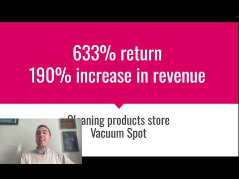
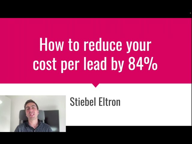
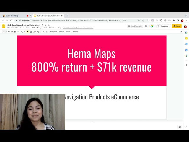
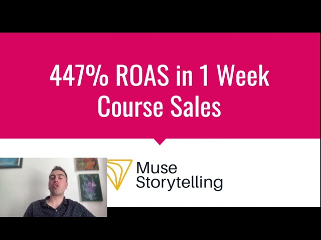
- Case Studies: Briefly showcase 2-3 results you've achieved for clients. Use quantifiable data: "Reduced ad spend by 30% while increasing leads by 50% for Client X."
This section is non-negotiable. I've seen conversion rates double just by adding strong social proof to a page. It's that important. If you find your landing page isn't converting, a lack of trust is one of the most likely culprits.
3. The Single Goal: Removing All Distractions
Your landing page has one purpose. For an e-commerce page, it's "Add to Cart." For a lead gen page, it's "Fill Out The Form." Anything that doesn't serve that one goal is a distraction and a potential exit route for the user. This means you must be ruthless:
- Remove the main navigation menu. Don't give them a link to your "About Us" page or your blog. You paid to get them to this page; don't give them an easy way to leave.
- Remove the footer links. Same reason. Keep only the essentials like your privacy policy.
- One CTA, repeated. Your main CTA button should appear multiple times as the user scrolls down the page. Don't confuse them with a secondary CTA like "Follow us on social media."
This can feel counter-intuitive, but it works. By limiting their choices, you make the desired action the most logical and easiest path to take. This is particularly crucial in competitive markets, where any friction can send a user to a competitor. We often implement this strategy when working with clients on landing page optimization in London, where the ad costs are high and every click needs to count.
How do you stop guessing and start testing what actually matters?
Right, your new landing page is live. It's built on a solid strategy and follows best practices. But that doesn't mean it's perfect. The final piece of the puzzle is a disciplined approach to testing. But please, do not start by testing the button colour. It's the least impactful thing you can test and a classic sign of an amateur optimiser.
You must prioritise your tests based on potential impact. Think of it as a hierarchy. You can't fix the roof when the foundations are crumbling.
The Testing Hierarchy (from most to least impactful):
- The Offer: This is the biggest lever you can pull. Test a "Free Trial" vs. a "Free Tool". Test a "Free Audit" vs. a "Downloadable Guide". A change in the fundamental value proposition will have a far greater impact than any copy or design tweak.
- The Headline: This is your second biggest lever. Test a pain-focused headline vs. a benefit-focused one. Test different ways of articulating the 'nightmare'.
- The Page Layout & Structure: Test a long-form page vs. a short-form one. Test the order of your sections. Does putting social proof higher up the page increase trust and conversions?
- The Media: Test a video hero section vs. a static image. Test different customer testimonials.
- The Copy: Test different sub-headlines and bullet points.
- The CTA Button: And finally, once everything else is dialled in, you can test the button copy ("Get Your Free Trial" vs. "Start Now") and, yes, even the colour.
To run these tests, you need software like Google Optimize (though it's being sunsetted), Unbounce, or Instapage. These tools allow you to create a variant of your page and split your ad traffic between the original (the 'control') and the new version (the 'variant'). You then run the test until you have enough data to declare a statistically significant winner. The key is to test one major element at a time. If you change the offer AND the headline, you'll have no idea which change was responsible for the uplift.
Your Landing Page Optimization Playbook (The Action Plan)
We've covered a huge amount of ground, from high-level strategy to the nuts and bolts of page design. Let's boil it all down into a clear, actionable playbook. This is the main advice I have for you. Follow these steps, in this order, and you'll be ahead of 95% of your competitors.
| Phase | Actionable Step | Why It's the Highest-Leverage Action |
|---|---|---|
| 1. The Strategic Audit | Define the 'Nightmare'. Interview customers and sales staff. Identify the single most urgent, expensive problem you solve. | This is the foundation of all effective messaging. A page that speaks to a real pain will always outperform one that just lists features. |
| Fix Your Offer. Replace your high-friction CTA (e.g., "Request a Demo") with a high-value, low-friction offer (e.g., "Start Free Trial," "Get Free Audit"). | The offer is the single biggest point of leverage on your page. A better offer can 2x or 3x your conversion rate overnight without changing anything else. | |
| 2. The Pre-Flight Check | Ensure Perfect Message Match. Your landing page headline and hero image must be a direct continuation of the ad that brought the user there. | This is the #1 way to reduce bounce rates and build instant trust. It reassures the user they are in the right place. |
| Load Up on Social Proof. Add your best testimonials, reviews, customer logos, and case study results prominently on the page. | Cold traffic from ads is skeptical. Social proof is the fastest way to overcome that skepticism and prove that you are a credible, trustworthy choice. | |
| 3. The Conversion Polish | Remove All Distractions. Delete your main navigation menu and any unnecessary footer links. Your page should have one clear goal and one clear CTA. | The "paradox of choice" is real. Limiting options makes the desired action the easiest and most obvious path for the user to take. |
| Optimise for Mobile. Go through your entire landing page and form submission process on your own phone. Is it fast? Is it easy? Are the buttons big enough to tap? | The majority of your paid traffic will come from mobile devices. A clunky mobile experience is like closing your shop to 70% of your customers. | |
| 4. The Growth Engine | Implement a Testing Plan. Start A/B testing, but follow the hierarchy: test your offer first, then your headline, then your layout and social proof. | This ensures you're testing the elements with the biggest potential impact first, leading to faster, more significant improvements in performance. |
When should you get expert help?
This playbook gives you the complete framework. If you follow it diligently, you will see better results from your paid ad traffic. But as you can probably tell, this is a deep specialism. It's a full-time job to conduct customer research, write compelling copy, design focused pages, set up A/B tests correctly, and analyse the data to find actionable insights.
As a founder or marketing manager, you have a hundred other things to do. Your time is your most valuable asset. The question is, is it best spent becoming an expert in landing page conversion, or running your business? For many, the answer is to partner with a specialist who has been down this road hundreds of times before. An expert can implement this entire playbook for you, avoiding the common pitfalls and accelerating your path to a profitable, scalable paid acquisition funnel.
We've seen inside countless ad accounts where the ads themselves were fine, but the landing pages were a disaster. For instance, I remember one campaign for a medical job matching SaaS client where we managed to reduce their cost per user acquisition from £100 down to just £7. That's the kind of impact that expert, strategic intervention can have.
If you're tired of pouring money into ads that don't convert and you're ready to build a landing page experience that turns clicks into customers, it might be time for a chat. We offer a free, no-obligation landing page audit and strategy session where we'll review your current pages, analyse your offer, and give you a clear, actionable plan to improve your conversion rates. It's our own high-value, low-friction offer to you.

Lukas Holschuh
Founder, Growth & Advertising Consultant
Great campaigns fail without expertise. Lukas and his team provide the missing strategy, optimizing your entire advertising funnel—from ad creatives and copy to landing page design.
Backed by a proven track record across SaaS, eLearning, and eCommerce, they don't just run ads; they engineer systems that convert. A data-driven partnership focused on tangible revenue growth.