TLDR;
- Your Google App Campaign creatives are failing because you're following a generic checklist, not building a rigorous testing engine. The algorithm has all the targeting power; creative is your only real lever.
- Stop making landscape videos and cropping them. You need to produce short, punchy, mobile-first portrait videos that feel native to platforms like YouTube Shorts and TikTok, where your ads will actually appear.
- Your ad copy should focus on solving a user's 'nightmare scenario', not listing your app's features. Use frameworks like Before-After-Bridge to show transformation, not just functionality.
- Your app store page (icon, screenshots, preview video) is your most important ad. If it doesn't convert, all your ad spend is wasted. Treat it as the final, critical step in your creative strategy.
- This guide includes a flowchart for a creative testing framework and an interactive calculator to help you estimate your potential Cost Per Install based on creative quality and targeting.
If you're reading this, chances are you've meticulously followed every "Google App Ads Best Practices" guide you can find. You've uploaded the specified number of text assets, image sizes, and video formats. And yet, your Cost Per Install (CPI) is through the roof, and your install volume is pathetic. You're burning cash and getting nowhere.
Here's the brutal truth: there is no magic checklist. The success of a Google App Campaign doesn't come from ticking boxes. It comes from understanding that the algorithm does all the heavy lifting on targeting. Your one and only job—the single most important lever you have—is to feed the machine with compelling, high-quality creative. Your competitors aren't winning because they found a secret setting; they're winning because they have a better creative strategy and a relentless testing process. Most advice out there is generic fluff. Let's talk about what actually works.
So, you followed the checklist and your ads are still rubbish?
The first thing to accept is that Google App Campaigns (what we used to call UAC) are a black box by design. You don't pick placements, you don't choose granular demographics, and you have very little direct control over who sees your ad. You provide the assets—headlines, descriptions, images, videos—and Google's AI goes to work, mixing and matching them across its entire inventory (Search, YouTube, Google Play, Discover, and the Display Network) to find people who are likely to install your app.
When you feed this powerful algorithm with generic, "safe" creative, you get generic, mediocre results. The system will find the cheapest, least-engaged users to show your ads to because your creative isn't strong enough to capture the attention of high-value audiences. It's a garbage-in, garbage-out system. You might think you're saving money by creating one-size-fits-all ads, but you're actually just telling Google to find you the worst possible customers.
This is why a simple checklist approach is doomed to fail. You need to think like a creative director and a data analyst combined. You need to build an engine that constantly produces new creative ideas, tests them scientifically, and iterates based on real-world performance data. This isn't about one ad; it's about building a sustainable system for growth. It's the only way to genuinely target and attract the high-value users you actually want, rather than just chasing cheap installs.
How do you build a creative engine, not just a one-off ad?
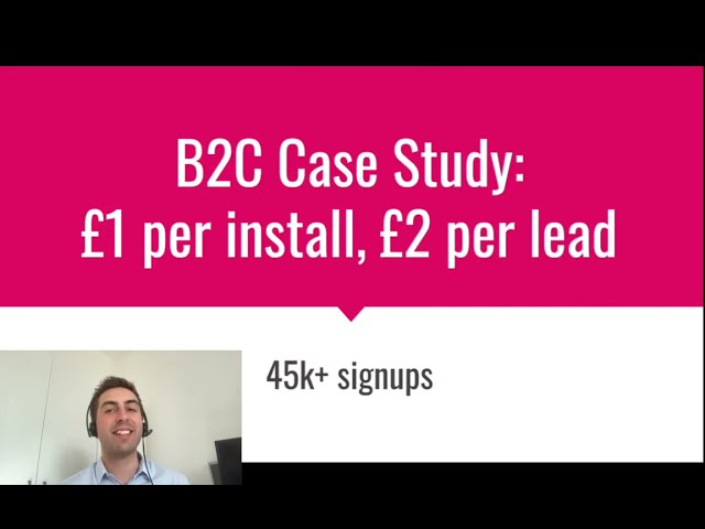
Stop thinking in terms of campaigns and start thinking in terms of a continuous creative flywheel. One-off efforts will give you one-off results. A systematic process will give you predictable growth. This is the exact approach we take with clients, and it's how we've seen campaigns deliver results like 45,000+ signups at under £2 per signup. It wasn't one miracle ad; it was the result of a disciplined process.
The process isn't complicated, but it requires discipline. It looks something like this:
1. Ideate: Don't start by thinking "we need a new video". Start by asking "what is a different problem we can solve for our user?" or "what is a new value proposition we can test?". Come up with 3-5 core concepts or angles. For a fitness app, one angle could be "convenience" (workout anywhere), another could be "community" (train with friends), and a third could be "results" (before/after transformations).
2. Produce: Create the assets for these concepts. This doesn't need to be a Hollywood production. Often, simple, authentic-looking content out-performs slick, corporate videos. The key is to create distinct assets for each concept so you can test them cleanly.
3. Test: This is where most people get it wrong. Don't just dump all your new creative into one ad group. Isolate your variables. Create a new ad group in your App Campaign for each new concept you're testing. For example, Ad Group 1 gets the "convenience" assets, and Ad Group 2 gets the "community" assets. This allows Google to optimise within each theme and gives you clear data on which angle resonates most.
4. Analyse & Iterate: Let the test run for at least 7-14 days to gather enough data. Don't just look at the CPI. Look at down-funnel metrics. Which ad group is driving users who actually complete the tutorial, or make a purchase, or subscribe? You might find an ad group with a slightly higher CPI drives much more valuable users. Double down on what works, kill what doesn't, and feed your learnings back into the "Ideate" stage for the next cycle.
Are your videos made for YouTube or for mobile?
Video is, without a doubt, the most powerful format for Google App Campaigns. It's where you can tell a story, demonstrate the app's "magic moment," and build an emotional connection. But honestley, most of the app ad videos I see are terrible. They're lazy, repurposed TV commercials or landscape YouTube videos that get awkwardly cropped into a vertical format with black bars. This is a massive mistake.
Your ads will primarily run on mobile-first, sound-off, vertical environments like YouTube Shorts, TikTok (via Google's network), and in-game interstitials. A landscape video looks alien and jarring in these feeds. It screams "I'm an ad!" and users scroll past it instantly. You have to create for the context your ad will be seen in.
That means:
- Portrait First (9:16): Design and shoot your videos in vertical format from the start. Don't crop. This fills the entire screen and feels native to the platform.
- Hook in 3 Seconds: You have to grab attention immediately. Start with a question, a shocking statement, or visually disruptive motion. The first three seconds determine if your ad gets watched or skipped.
- Design for Sound-Off: Assume no one will have their sound on. Use bold text overlays, captions, and strong visual cues to tell your story. Your video must make sense with zero audio.
- Show, Don't Just Tell: Don't waste time with logos and talking heads. Get straight into the app. Show screen recordings of the most satisfying, valuable, or fun part of your app's experience.
- Clear CTA: End with a very clear, simple Call to Action. "Download Now", "Install for Free", "Try it Today". Make it obvious what you want the user to do.
The difference in performance is not subtle. A well-crafted portrait video can outperform a lazy landscape video by a huge margin. We've seen it time and time again in our client campaigns.
What if I don't have the budget for endless video production?
This is a common concern, but a valid one. While video is king, it's not the only tool in your arsenal. A high-performing image can still beat a low-performing video, and they are definately faster and cheaper to produce. The key is to apply the same principles: grab attention, communicate value, and have a clear call to action.
For static images, move beyond boring screenshots.
- Text Overlay is a Must: Your image needs to work like a mini-billboard. Use a large, readable font to state your main benefit or ask a provocative question. "Pay off debt 3x faster?" is better than a generic image of your app's home screen.
- Show the 'After' State: Don't just show your app's interface. Show the result of using your app. For a photo editing app, show a stunning, edited photo. For a budgeting app, show a graph of savings going up.
- Use Strong Contrast & Colour: Your ad is competing in a visually crowded feed. Use bright, bold colours and high contrast to stand out from the noise.
There's also HTML5 / Playable Ads. These are mini, interactive versions of your app that users can play with directly inside the ad unit. They are particularly powerful for mobile games but can also work wonders for utility and productivity apps. They let a user experience the "magic moment" of your app without the friction of an install. The conversion rates can be incredible. However, they are complex and expensive to develop, so this is typically a strategy for more mature apps with larger budgets. But it's something to keep in mind as you scale, as it's a key part of any comprehensive app marketing playbook.
Is your ad copy describing features or solving nightmares?
This might be the single biggest strategic mistake I see app developers make. Your ad copy—your headlines and descriptions—is packed with features, technical specs, and jargon. "Our app uses an advanced algorithm for..." No one cares. People don't download an app because of its features. They download it to solve a painful problem or achieve a desired transformation.
You need to stop selling the drill and start selling the hole. Your ideal customer isn't thinking "I need a productivity app with Kanban boards and Gantt chart integration." They're thinking, "I'm overwhelmed, my team is missing deadlines, and I'm terrified my boss is going to think I'm incompetent." Your job is to connect your app to that nightmare scenario.
A powerful framework for this is the Before-After-Bridge:
- Before: Describe their current world of pain. Agitate the problem. Use emotional language. "Another Sunday evening spent dreading Monday?"
- After: Paint a picture of the ideal future state they desire. The world with your app in it. "Imagine waking up on Monday feeling organised, in control, and ahead of schedule."
- Bridge: Position your app as the simple, easy bridge to get them from Before to After. "Our app is the bridge. Get organised in 5 minutes. Download now."
Your ad copy assets should be built around this. Give Google a mix of headlines and descriptions that hit on different pain points and desired outcomes. Let the algorithm test which combination works best. This is a core tenet of building an irresistible ad creative strategy that resonates with real human emotions.
Did you forget your most important ads are on your store page?
This is a critical, and often overlooked, part of your creative strategy. Every single person who clicks on your ad, no matter how brilliant it is, lands on your app store page. If that page doesn't seal the deal, you've wasted your click and your money. Your app icon, screenshots, and preview video are not just metadata; they are the final and most important ad in your funnel.
You need to optimise your store listing with the same rigour you apply to your paid ads:
- The Icon: Your icon is your app's face. It appears everywhere. It needs to be simple, memorable, and instantly recognizable. It should stand out against a variety of backgrounds. Don't cram too much detail into it. Test different designs to see what gets the highest tap-through rate.
- The Screenshots: These are your billboards. Don't just upload random UI screens. Curate a story. Your first 2-3 screenshots are the most important. They should function like a comic strip, showing the main value proposition. Use text overlays on each screenshot to explain the benefit of what the user is seeing.
- The Preview Video: If you have a preview video on your store page, it will often be shown in ads on Google Play. It should follow all the rules of a good ad video: quick hook, show the value, and be designed for mobile. This is a critical asset for both Google App Ads and its counterpart, Apple Search Ads; getting it right benefits both platforms.
Think of your ad campaign and your store page as a single, unified experience. A brilliant ad that leads to a confusing or unconvincing store page is a broken funnel. An excellent store page can't save a terrible ad. They have to work together. This integration is a core pillar of any plan to scale app installs effectively.
How much should this cost and what does 'good' look like?
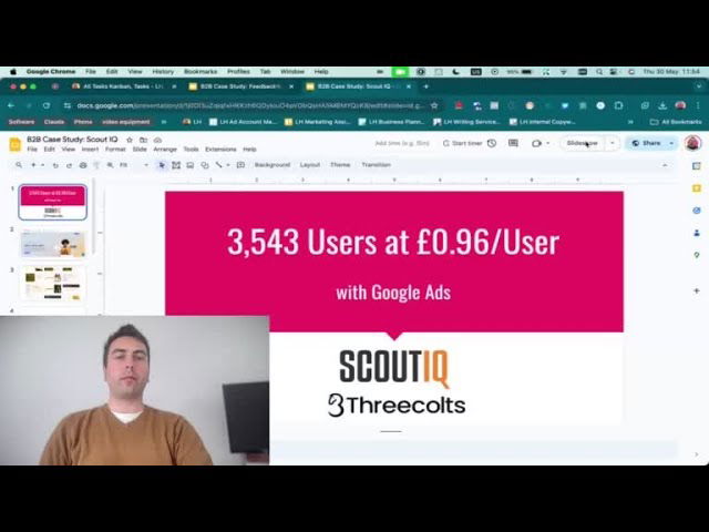
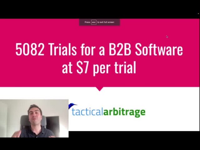
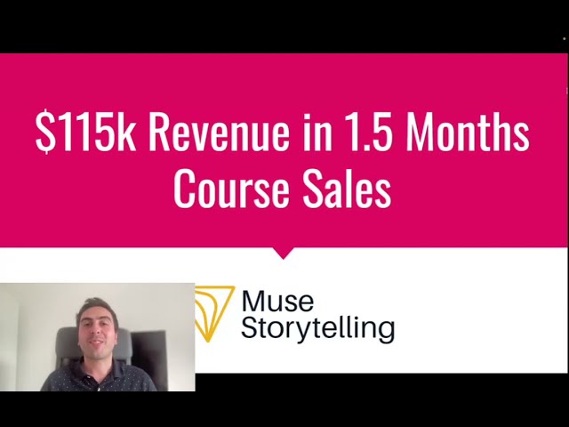
This is the million-dollar question. The answer, frustratingly, is "it depends". Your Cost Per Install (CPI) will be affected by your app category (gaming is different to finance), the countries you target (a US install costs far more than one in India), and above all, the quality of your creative.
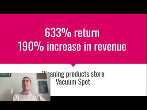
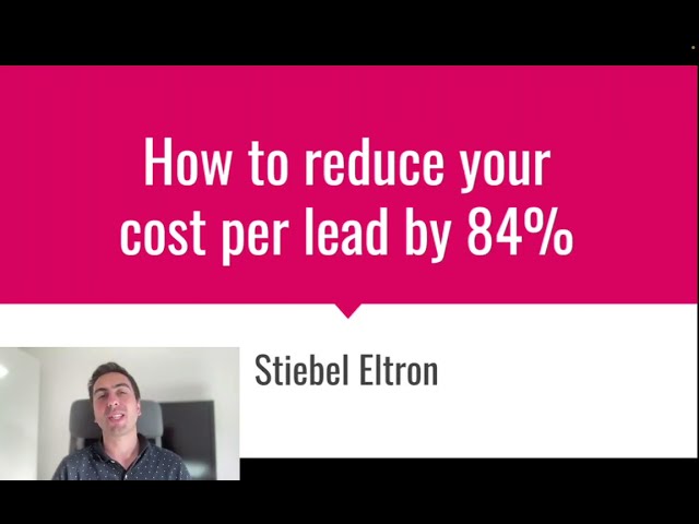
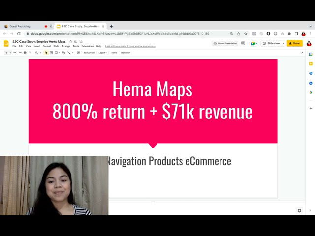
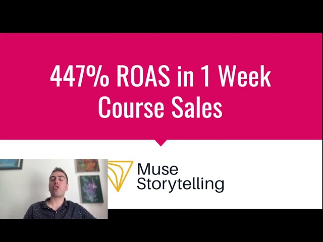
For one B2B software client, we saw a $2.38 cost per registration, which was fantastic for their niche. For another app in the events space, we managed to get their cost per signup under £2 across more than 45,000 new users. These numbers aren't achieved by accident. They are the result of the relentless testing framework we've discussed. Your goal shouldn't be to hit a specific number on day one, but to consistently drive your costs down over time by improving your creative.
To give you a rough idea, I've built a simple calculator below. Play with the sliders to see how different factors can influence your potential CPI. This is purely for illustration, but it shows the powerful relationship between creative quality and acquisition cost.
What should I do tomorrow morning?
Theory is nice, but action is what matters. Stop chasing a magic bullet and start building your creative engine. You don't need a huge budget or a massive team to begin. You just need a disciplined process. Here is a simple plan you can start implementing immediately.
I've detailed my main recommendations for you below:
| Area of Focus | Action Item | Why It Matters | Priority |
|---|---|---|---|
| Video Creative | Produce two new 15-second portrait (9:16) videos based on different user pain points. | Video is the highest impact format. Testing problem-focused angles in a native format is the fastest way to find a winner. | High |
| Ad Copy | Write 5 new headlines and 5 new descriptions using the "Before-After-Bridge" framework. Focus on outcomes, not features. | Google mixes and matches text assets. Providing high-quality, emotionally resonant ingredients gives the algorithm more to work with. | High |
| Campaign Structure | Create a new Ad Group for each new creative concept (e.g., Ad Group "Pain Point A" gets Video A + Copy Set A). | This isolates your variables, allowing you to clearly see which creative theme is performing best, rather than guessing. | High |
| App Store Page | Rewrite the descriptions for your first 3 screenshots to tell a story and highlight key benefits. | Your store page is your final conversion point. If it fails, all ad spend is wasted. This is a high-leverage, low-cost optimisation. | Medium |
| Image Creative | Create 4 new static images with bold text overlays showing a clear benefit. | Images are faster to produce than video and give Google more assets to test across its Display Network and other placements. | Medium |
When does it make sense to get help?
You can absolutely implement everything in this guide yourself. It will take time, effort, and a fair bit of trial and error. You'll likely waste some budget along the way as you learn the ropes. That's the cost of education.
The reason companies hire an expert or an agency is to accelerate that process and reduce the cost of those mistakes. A team with experience has already run hundreds of these tests across dozens of apps. They've already made the mistakes you're about to make. They have proven frameworks and a deep understanding of what works in different niches. They can take this entire process—from ideation and production to testing and analysis—and run it for you, faster and more efficiently than you could on your own.
It's not about outsourcing a task; it's about investing in expertise to get to your growth goals faster. If you're serious about scaling your app and want to see how a professional, data-driven creative strategy can transform your results, we offer a free, no-obligation consultation. We'll be happy to review your current campaigns and provide some actionable insights you can use right away.

Lukas Holschuh
Founder, Growth & Advertising Consultant
Great campaigns fail without expertise. Lukas and his team provide the missing strategy, optimizing your entire advertising funnel—from ad creatives and copy to landing page design.
Backed by a proven track record across SaaS, eLearning, and eCommerce, they don't just run ads; they engineer systems that convert. A data-driven partnership focused on tangible revenue growth.